Lydia
A leading mobile financial service with a strong community of free users, seeking to boost premium subscriptions and profitability


MY ROLE
UX/UI Designer
TOOLS
Figma, Notion
TEAM
3 Designers
DATE
2022
SCOPE
2 weeks

Lydia
Lydia
A leading mobile financial service with a thriving community of free users, seeking to subtly highlight usage limits & encourage premium subscriptions.
A leading mobile financial service with a thriving community of free users, seeking to subtly highlight usage limits & encourage premium subscriptions.
MY ROLE
UX/UI Designer
TOOLS
Figma, Notion
TEAM
3 Designers
DATE
2022
SCOPE
2 weeks
Overview
CONTEXT
Case Study
In collaboration with Felix Lepoutre, Lydia's lead designer, our team explored real challenges faced by the product teams. (The Design Crew school)
Company Background
The french company recently expanded beyond peer to peer payment by developing new features and initiated their transition as a super app for financial services. Users can now get accounts, payment cards, loan, insurance, money pots, gift cards...
They want to challenge the traditional retail banking model and drive cashless revolution in Europe with an instant, secure and frictionless mobile first customer focused solution.
They raised over 160 millions in funding from major existing shareholders such as Tencent and Accel to accompany their expansion across Europe.
CHALLENGE
How can Lydia introduce new
usage limits and boost suscription to premium plans ?
How can Lydia introduce new
usage limits and boost suscription to premium plans ?
How can Lydia introduce new usage limits and boost suscription to premium plans ?
How can Lydia introduce new
usage limits and boost suscription to premium plans ?
WHY ?
Next step is profitability
Each transaction incurs a fee, with millions of transactions per month.
An increase of their Monthly Recurring Revenue would contribute to the company’s bottom line.
Lydia launched two premium plans (Lydia Blue & Lydia Black) that offer higher soft & hard limits over the free plan but didn’t raised awareness about free limits.
New limits were introduced to users in January 2021 in regards to monthly transaction volume and payment ceiling but lack in app tracking.
SOLUTIONS
Educate users about usage limits & raise
awareness of premium plans
Educate users about usage limits & raise awareness of premium plans
Educate users about usage limits & raise awareness of premium plans
Payment flow
We created an informative
notification during the payment flow
Entry points
We multiplied strategically placed entry points to the limits pages
Limits & Premium
We structured & clarified info
about limits & premium plans options
Banking expertise
We implemented elements of reassurance regarding their banking expertise
Discover
Discover
AUDIT &
BENCHMARKS
AUDIT & BENCHMARKS
AUDIT & BENCHMARKS
AUDIT &
BENCHS
User engagement strategies
User engagement strategies
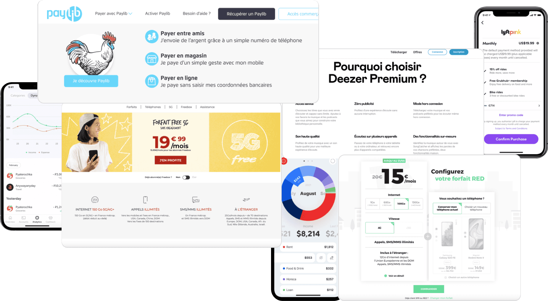
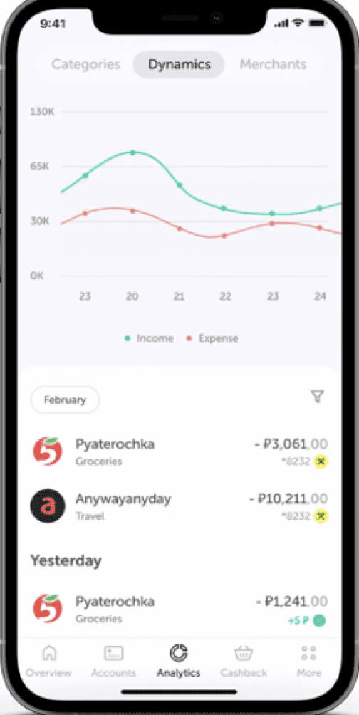
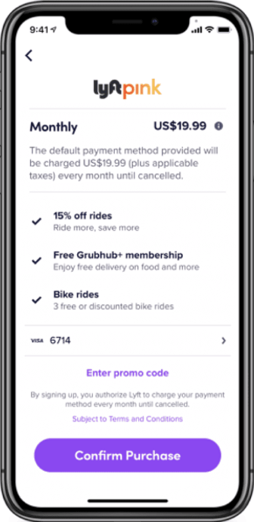
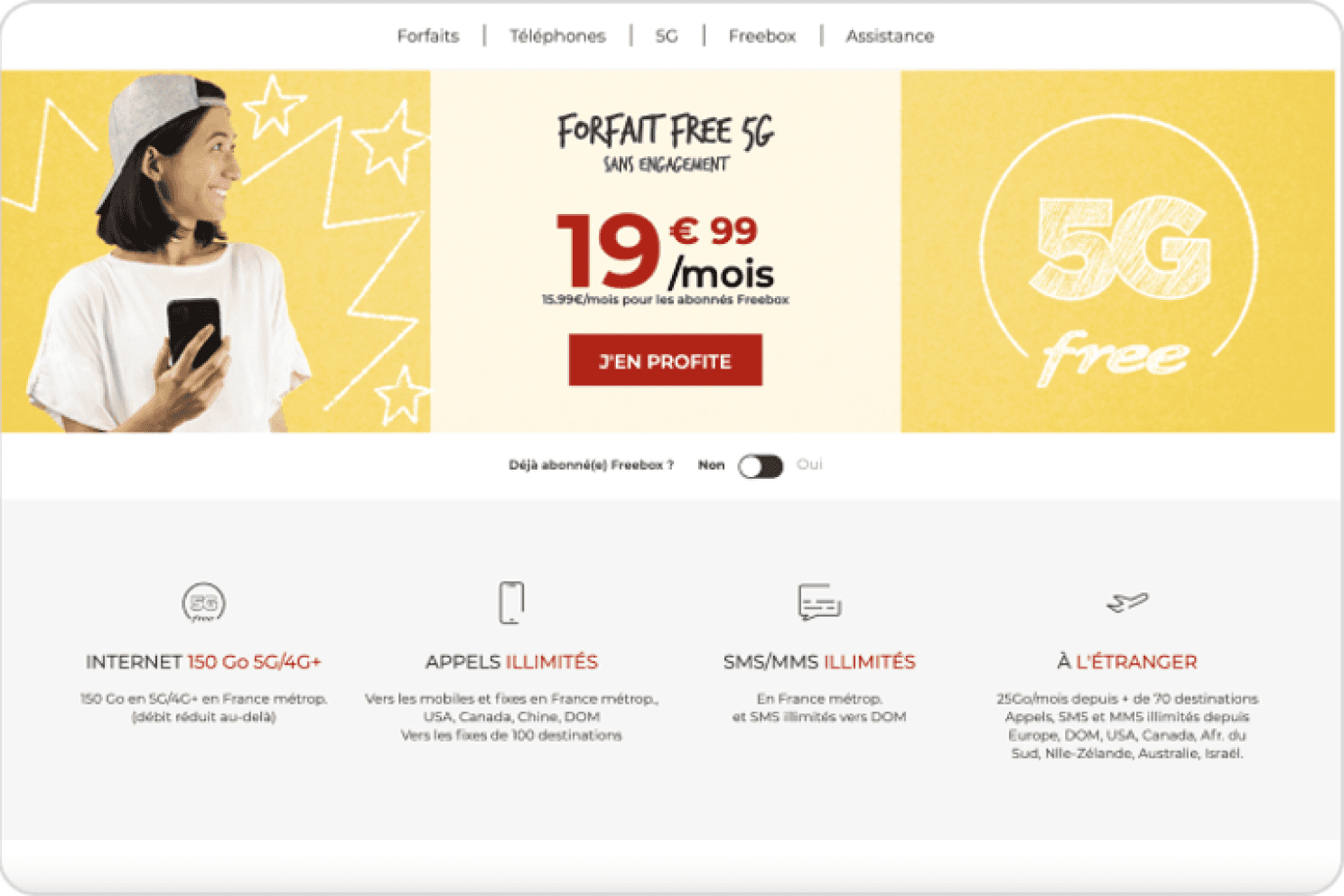
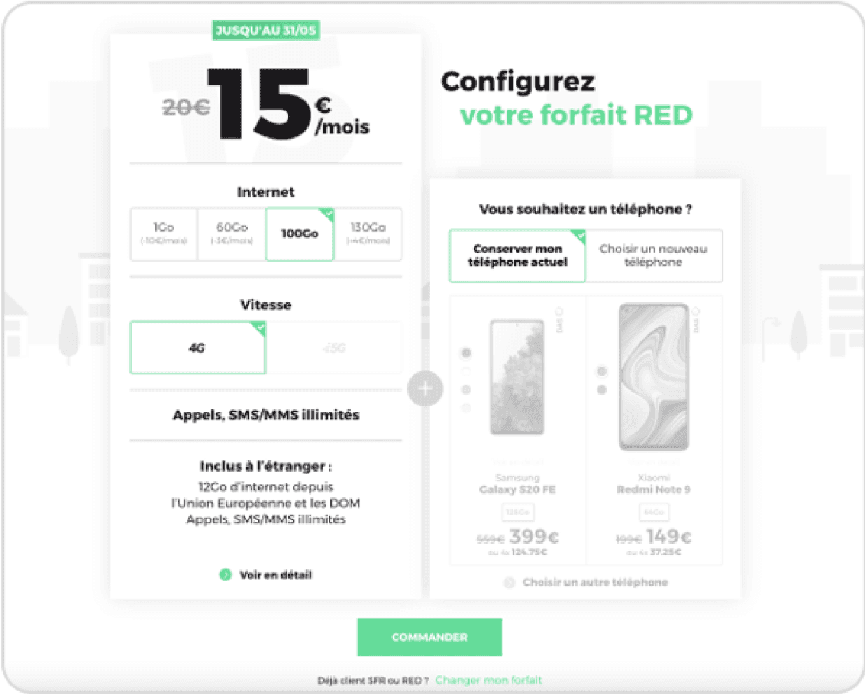
Conducting competitive research across various industries enabled us to prepare effectively for user interviews. By analyzing Paylib, SFR, Free, Deezer, Lyft Pink, Tullab, and Cbank, we gained insights into user engagement strategies across industries.
Gauges & Usage
From the telephony sector, we drew inspiration from consumption visualization through bar charts and gauges. These visualizations clearly show usage patterns.
Profile Summary
This consumption data is often accessible on user profiles, offering personalized insights and a detailed understanding of individual usage.
Premium Features
From the telephony sector, we drew inspiration from consumption visualization through bar charts and gauges. These visualizations clearly show usage patterns.


USERS
INTERVIEWS
USERS INTERVIEWS
USERS INTERVIEWS
UX Goals & Context
UX Goals & Context
We conducted 5 user interviews to determine pain points and users perception of Lydia. Participants were aged from 18 to 36 years old : 3 regulars users, 1 Lydia addict and 1 occasional user.
1
GAIN UNDERSTANDING OF USERS’ OPINION ON FREEMIUM LIMITS
Discover what made them willing to upgrade to a paid plan the last time they switched from freemium.
2
IDENTIFY USERS’ BANKING RELATIONSHIP
Determine needs, habits and gather their thoughts about digital-only banks and
traditional banks
Determine needs, habits and gather their thoughts about digital-only banks and traditional banks
3
FIND OUT ABOUT LYDIA USAGE
Understand users’s global experience of the app : habits, expectations, pain points
Check awareness of existing limits and premium plans.
Understand users’s global experience of the app : habits, expectations, pain points; Check awareness of existing limits and premium plans.
Learning #1
Lydia is widely recognised for its fastness, practicality and
fluidity
Users appreciate its efficiency and stay less than one minute
5/5
participants
Learning #2
Reference for peer-to-peer payments, but their credibility is questioned in the banking sector
Users need trust in its banking expertise
reliability
5/5
participants
I refused to paid those 2 euros fees. It’s always been free so I decided to wait until the following month to transfer that money
”
“
Morgan, 29 yo
Regular User

Learning #4
Strong unwillingness to suscribe to premium offers.
Users adapt well to limited features to avoid extra costs.
4/5
participants
Learning #3
Notable unawareness & misunderstanding of new usage limits and premium offers.
Users don't understand the impact of limits
on their regular use
4/5
participants
Define
PERSONAS

Arya
01
“
Energetic and proactive, Arya excels in multitasking and engaging with social media. Always up for a drink with friends, she knows the best spots in the city.
”
Behavior
Arya and her husband just secured a loan with their traditional bank Société générale for their first property purchase
She discovered Lydia through her friends and enjoys the convenience and easiness of the app
Motivations
Always on the lookout for new trends, she likes innovative apps that make her life easier by saving time
She pays everything with her credit card and never carries change, she regularly makes small transfers to her friends
29 yo
Toulouse
Married
Nurse
Loyalty to bank
Social life
Technology
Florian
02
“
Florian works remotely while travelling. As a
globetrotter he spends half the year abroad.
His best friends often join him during
his work remote trips
”
Behavior
Florian uses Triccount regularly to organise group expenses
He was an early adopter of Lydia’app : he likes the possibility to manage his budget in real time on his phone
Motivations
Florian has multiple bank accounts : Boursorama, Société Générale, Hello Bank... He would like to manage all his bank accounts in one place.
He is looking for an optimal aternative to pay and withdraw money worldwide without exchange fees.

34 yo
Paris
Single
Developer
Loyalty to bank
Social life
Technology
HOW MIGHT WE ?
1
Reassure users about Lydia’s reliability and its financial services expertise ?
2
Grab users’ attention to encourage them to further explore the
app ?
3
Introduce freemium limits & highlight premium plans benefits ?
Develop
USER FLOW
Payment Flow
We analyzed the existing user flow data to identify key interaction points and determine optimal locations for implementing new entry points. Given that peer-to-peer payment is the core feature of Lydia Business, it was crucial to leverage it to our advantage to raise awareness and ensure the visibility of usage limits.
By strategically placing these entry points, we aimed to improve user engagement and ensure that payment limits were clearly communicated throughout the user journey.
IDEATION
EXERCICES
Creative Brainstorming
We decided to kick start our ideation session with a mindmap to visually represent the idea of usage limits transparency followed by a crazy 8s to generate ideas on how to prioritise and highlight information.
MINDMAP
Identify key areas to focus on for raising awareness
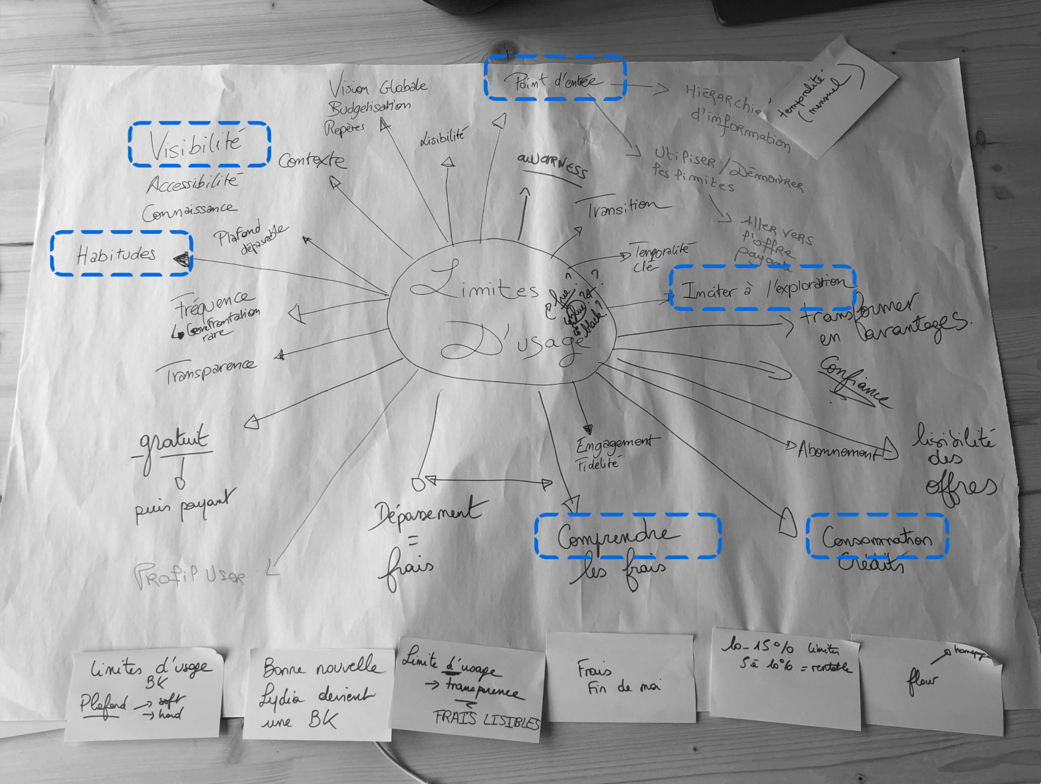
Encourage exploration
Consumption
Understandable
Visibility
Entry points
User habits
CRAZY 8S
Freemium Limits &
Key Features Highlighted
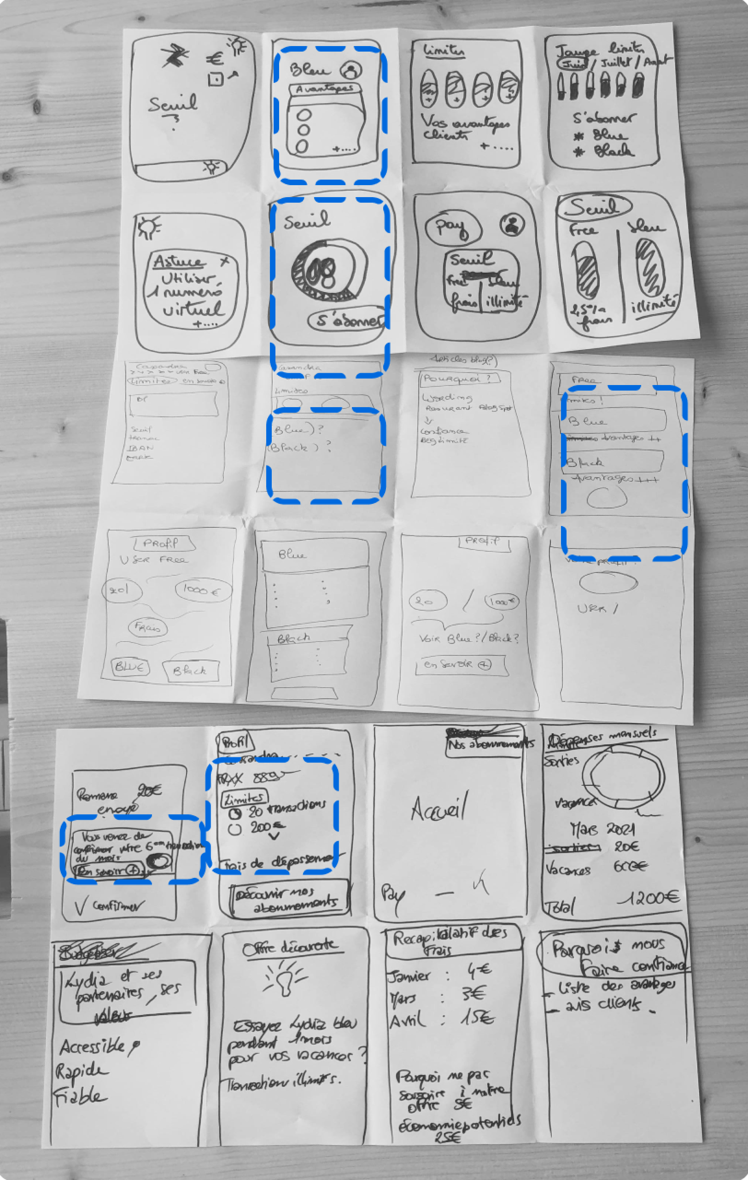
Usage tracking vizualisation
Notification duriing payment

Our priority was to determine multiple entry points to limits pages.
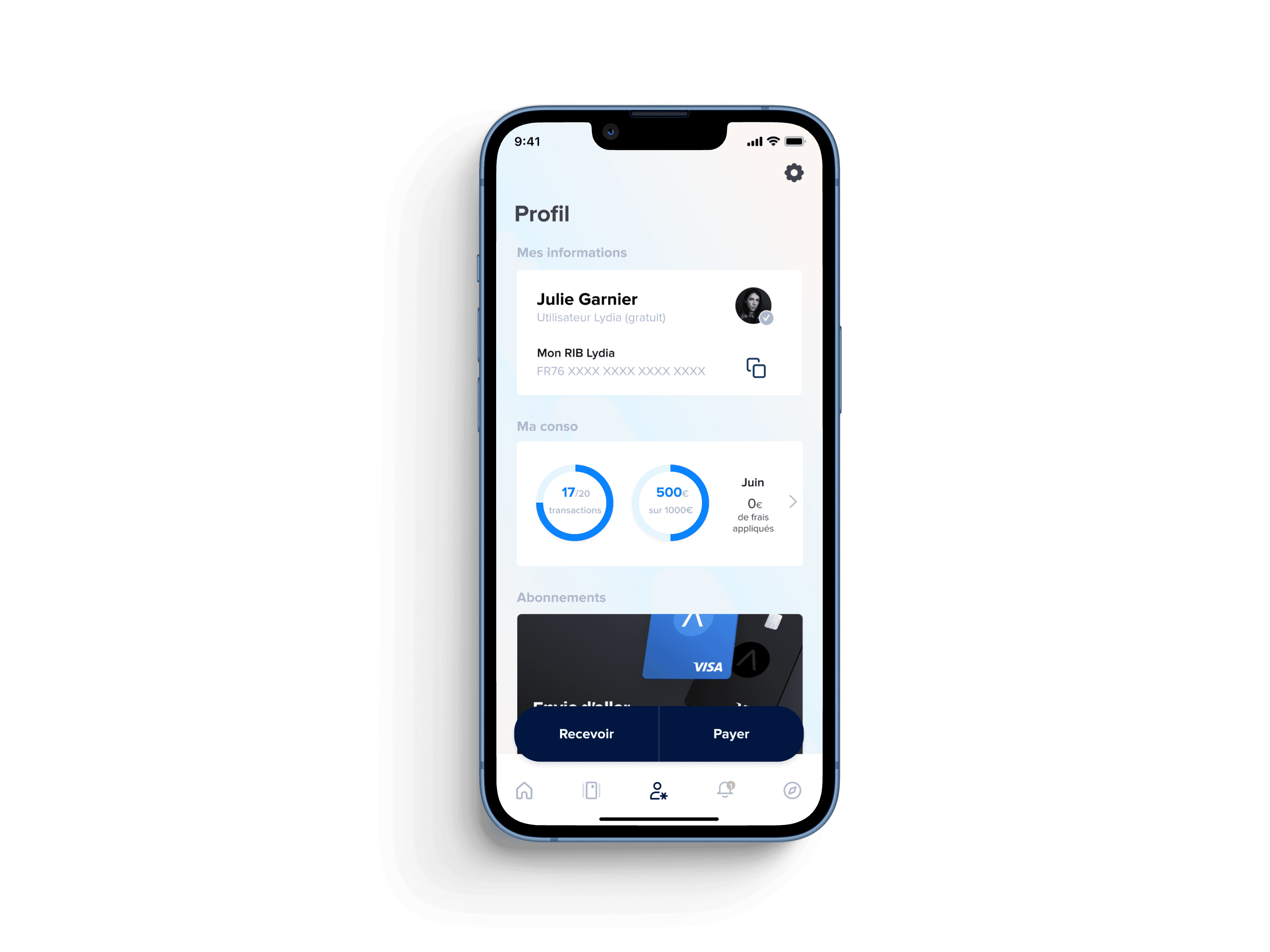
To that end we included a clickable consumption summary on the profile page

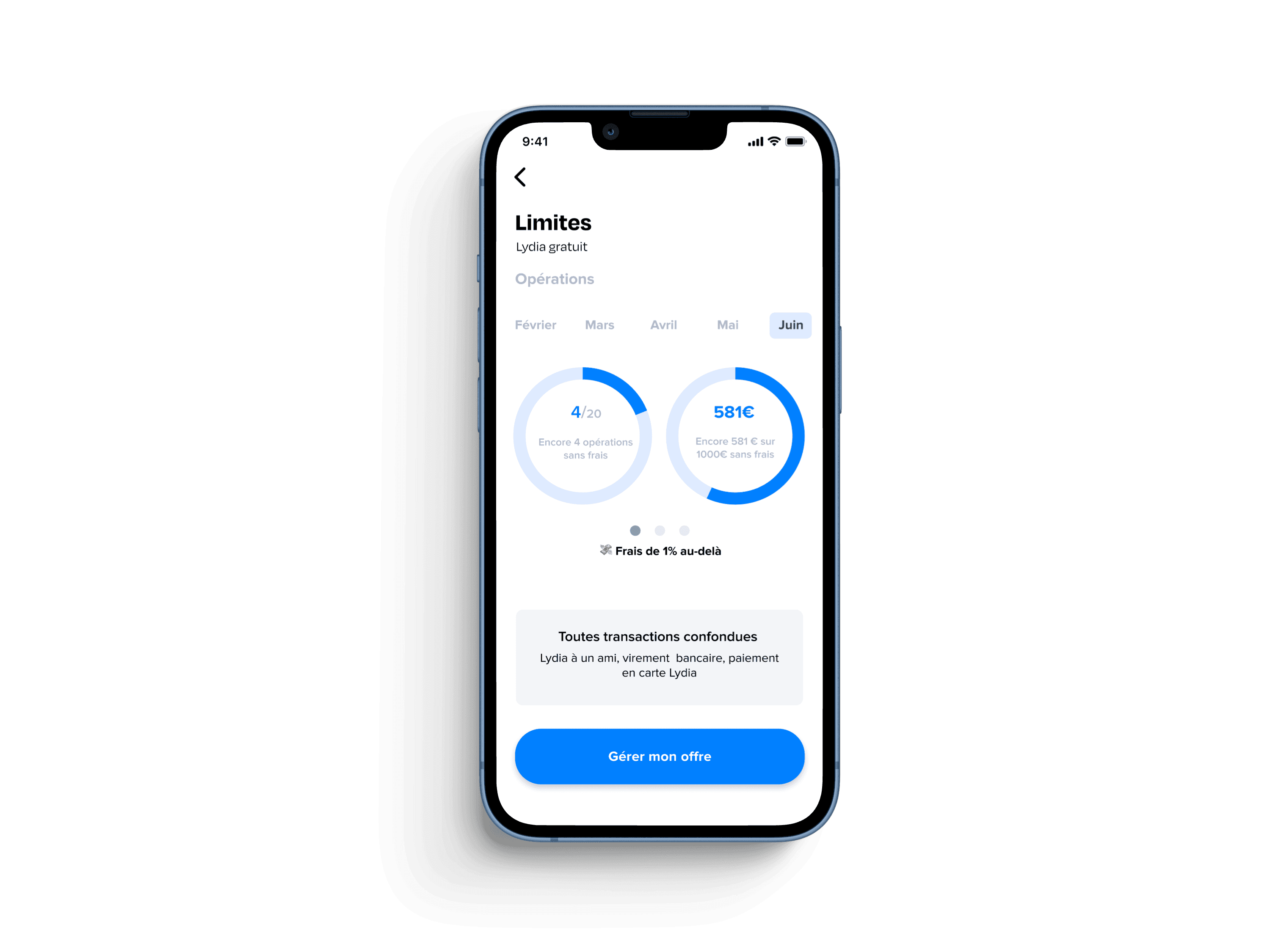
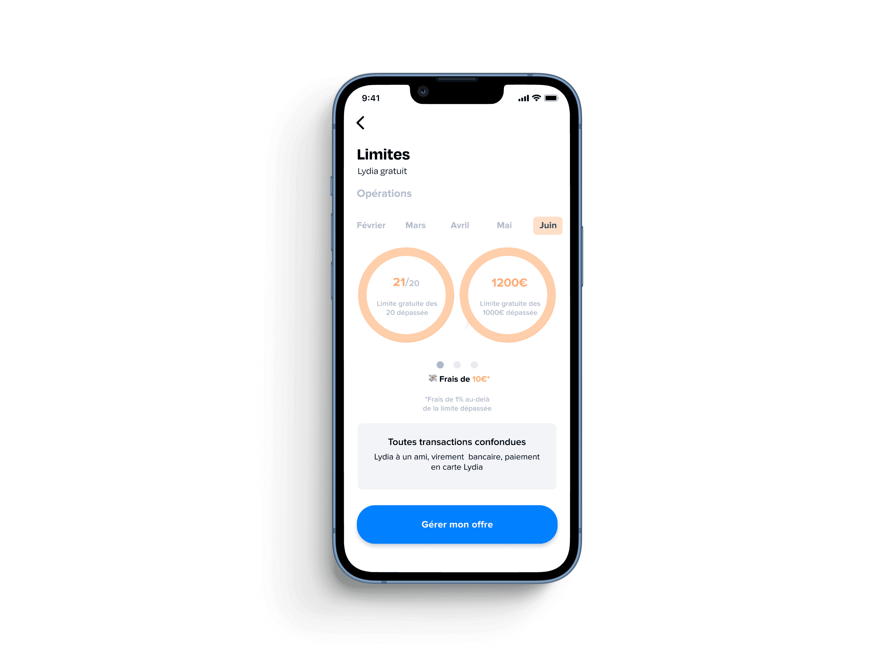
Original limit pages
Enhanced limits pages
with visual cues
Deliver
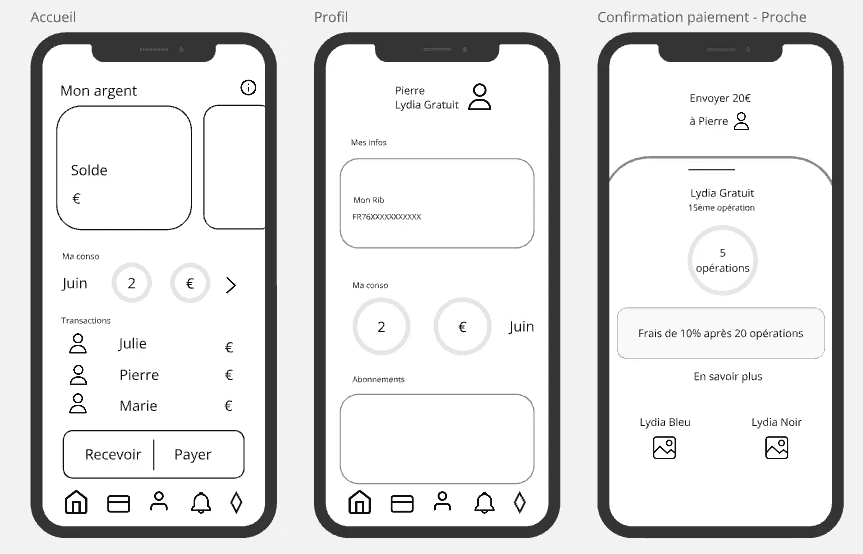
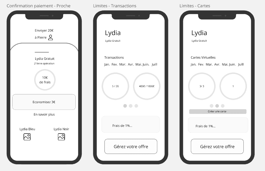
MID FIDELITY WIREFRAMES
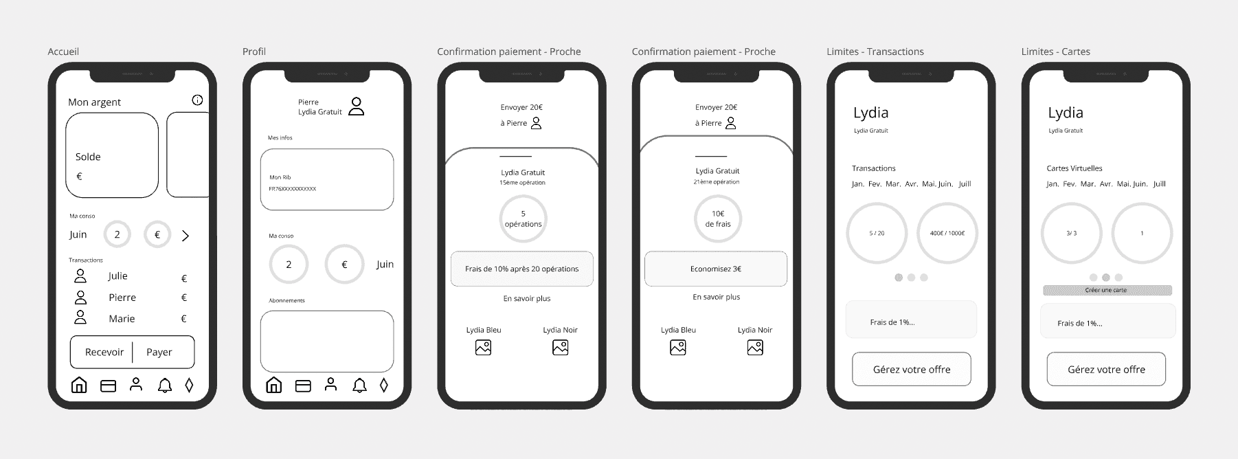
INITIAL SOLUTION - V1
Profile & usage
overview
Consumption
summary
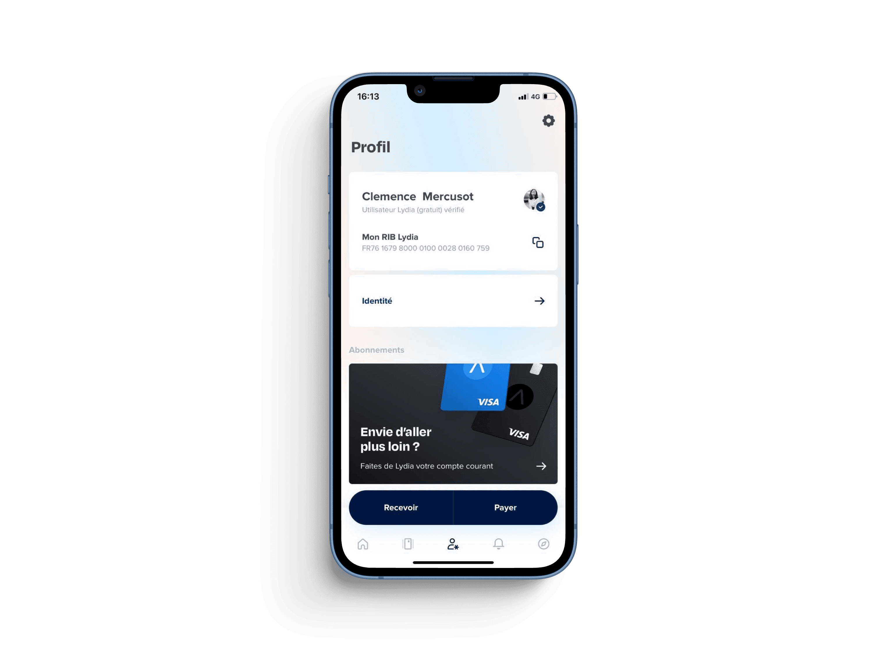
Original profile screen
Original profile screen
Redesigned profile screen
Redesigned profile screen
Circular
Gauges
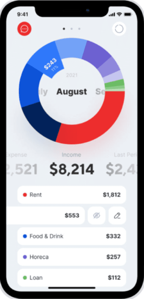
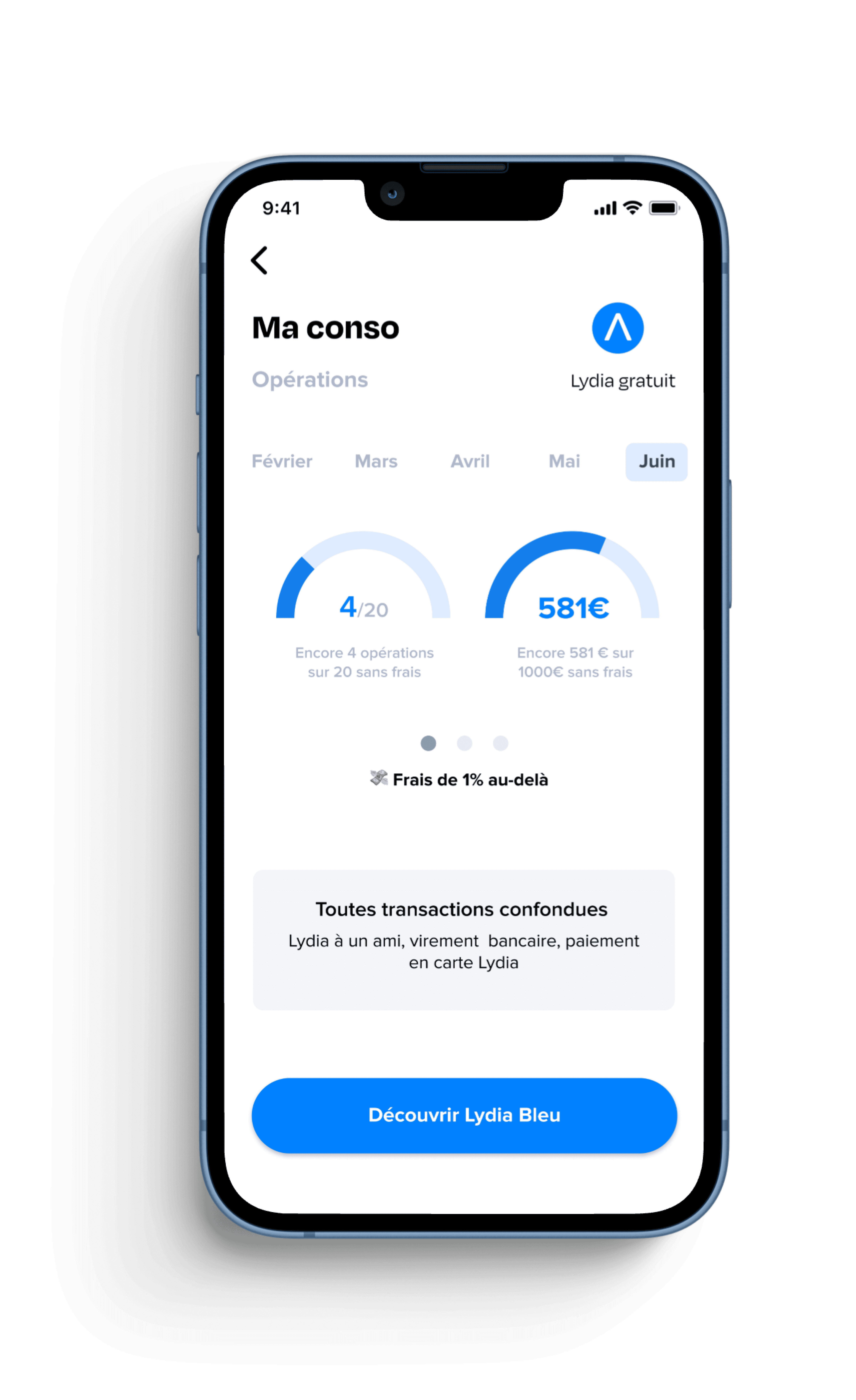
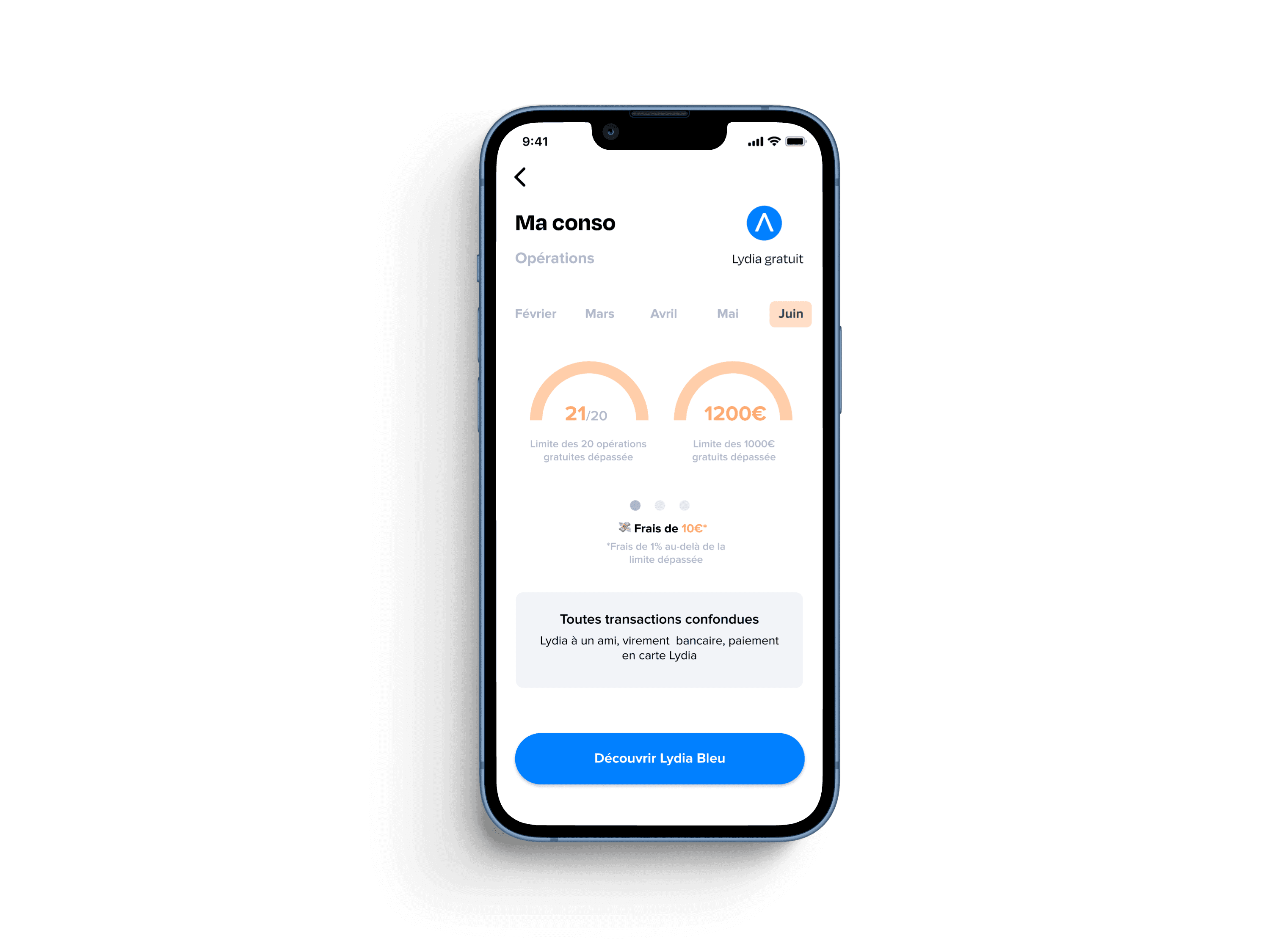
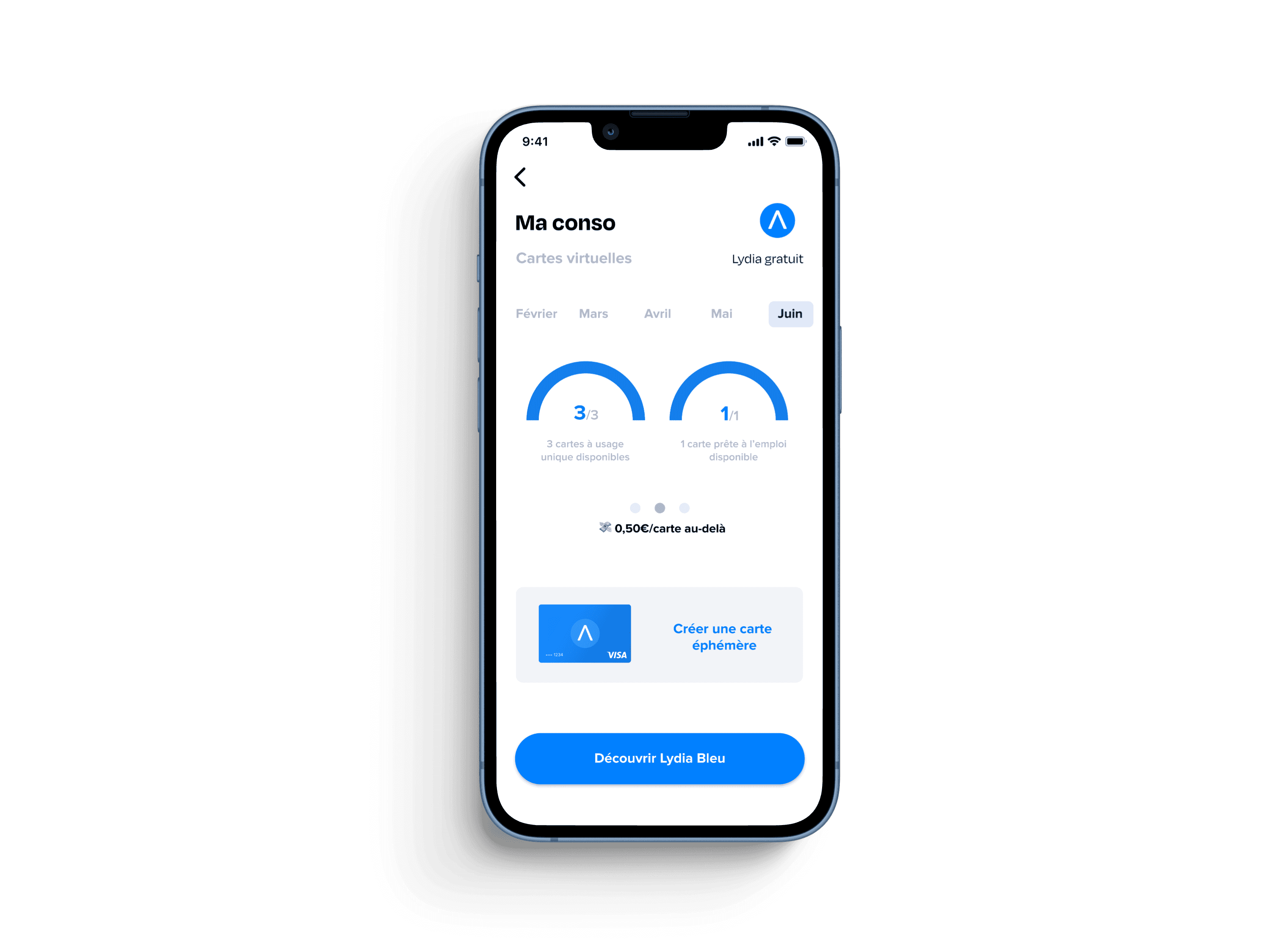
We consolidated related information onto a single screen with dot navigation to make the consumption overview easily comprehensible at a glance.
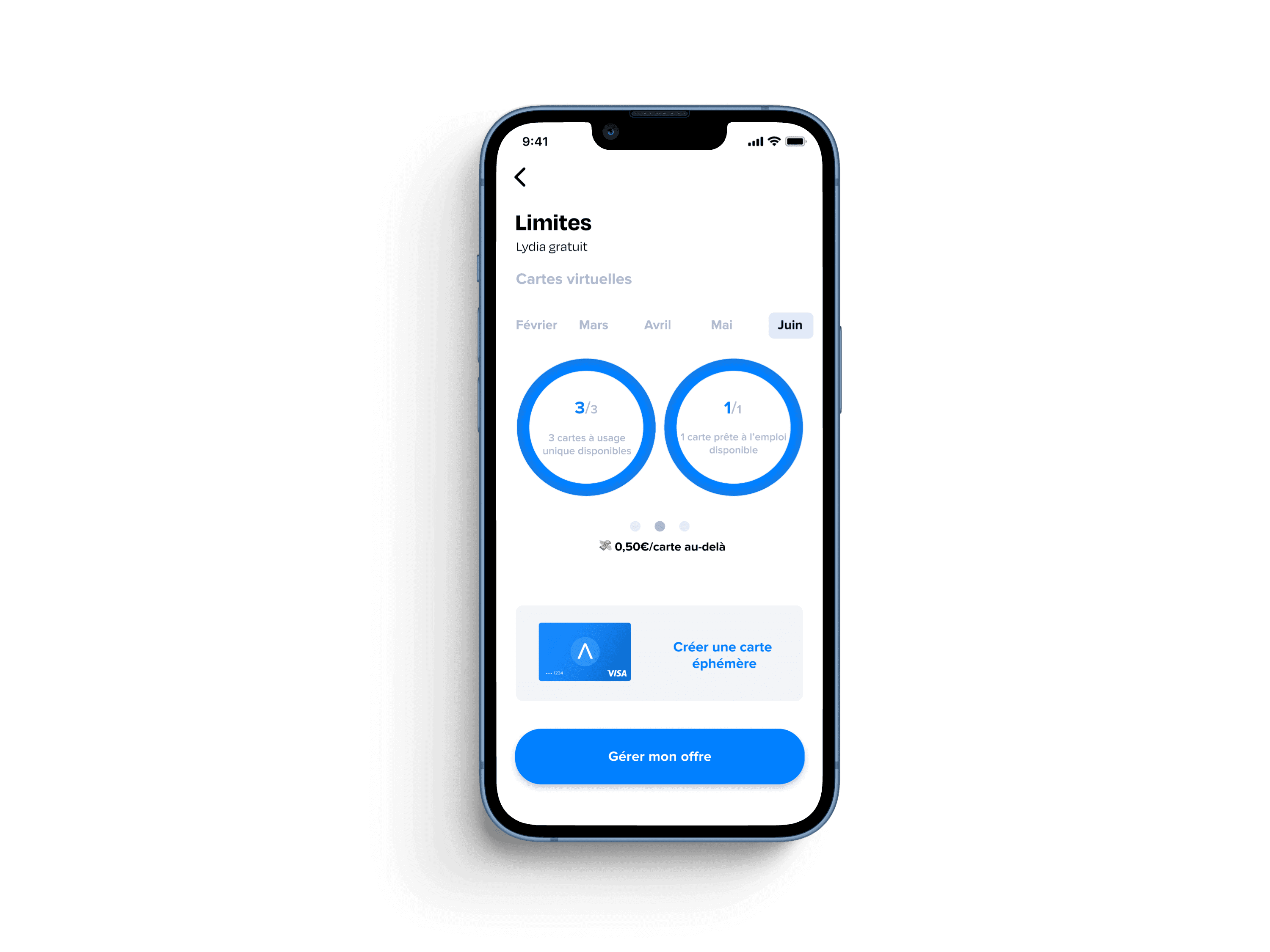
Dot navigation
We replaced the discrete clickable "Subscribe" link to premium plans with a prominent "Manage My Plan" CTA button.
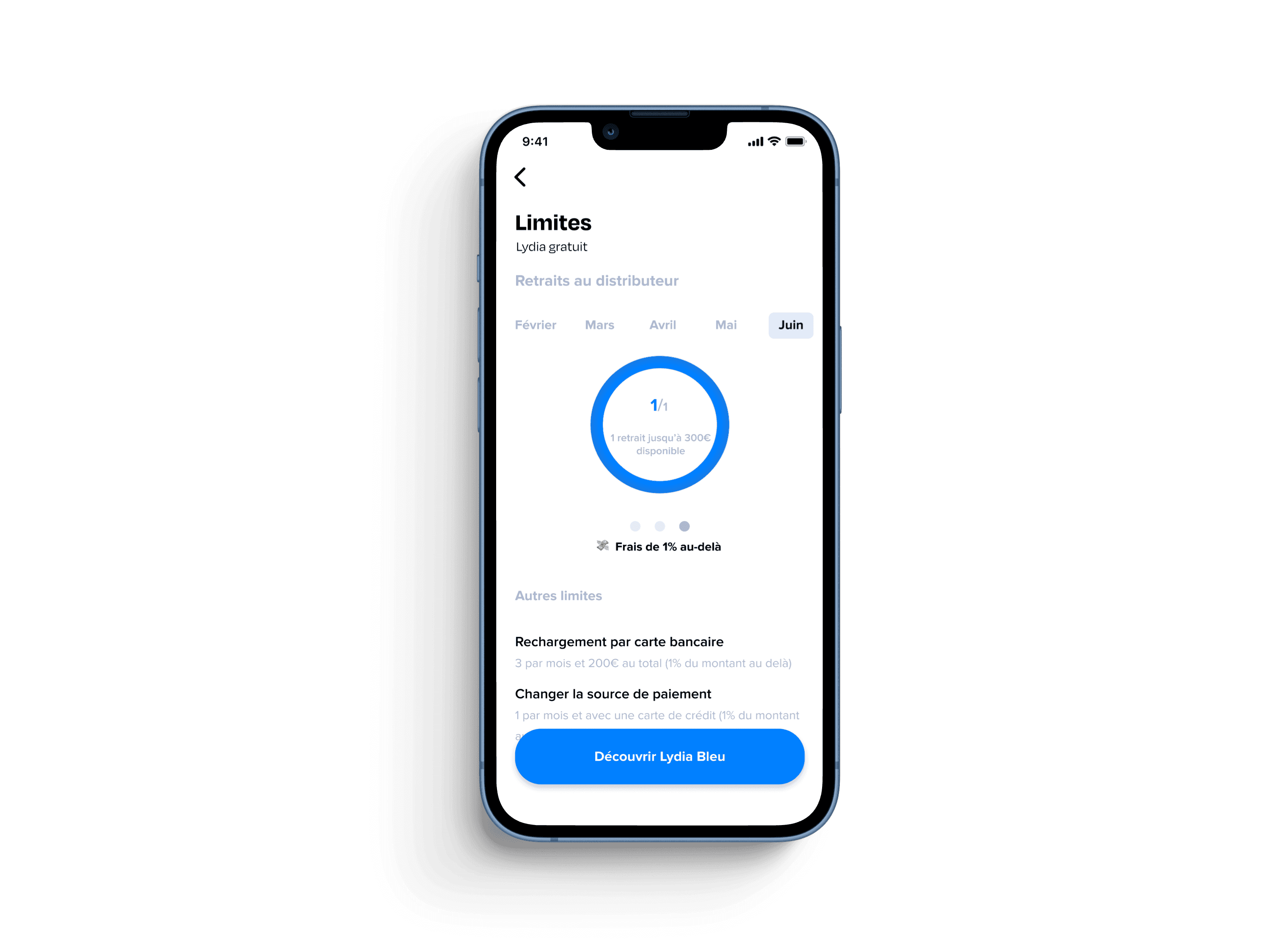
Manage my plan
We added circular gauges to the limit pages to minimize cognitive load.
Orange for exceeded limits and blue for limits not yet reached, allowing users to easily understand their status at a glance
Define
PERSONAS
PERSONAS


Arya
01
29 yo
Toulouse
Married
Nurse
“
Energetic and proactive, Arya excels in multitasking and engaging with social media. Always up for a drink with friends, she knows the best spots in the city.
”
Behavior
Arya and her husband just secured a loan with their traditional bank Société générale for their first property purchase
She discovered Lydia through her friends and enjoys the convenience and easiness of the app
Motivations
Always on the lookout for new trends, she likes innovative apps that make her life easier by saving time
She pays everything with her credit card and never carries change, she regularly makes small transfers to her friends
Loyalty to bank
Social life
Technology
Florian
02
34 yo
Paris
Single
Developer
“
Florian works remotely while travelling. As a globetrotter he spends half
the year abroad. His best friends often join him during his work remote trips.
”
Behavior
Florian uses Triccount regularly to organise group expenses
He was an early adopter of Lydia’app : he likes the possibility to manage his budget in real time on his phone
Motivations
Florian has multiple bank accounts : Boursorama, Société Générale, Hello Bank... He would like to manage all his bank accounts in one place.
He is looking for an optimal aternative to pay and withdraw money worldwide without exchange fees.
Loyalty to bank
Social life
Technology

HOW MIGHT WE ?
HOW MIGHT WE ?
1
1
1
Reassure users about Lydia’s reliability and its financial services expertise ?
Reassure users about Lydia’s reliability and its financial services expertise ?
Reassure users about Lydia’s reliability and its financial services expertise ?
2
2
2
Grab users’ attention to encourage them to further explore the app ?
Grab users’ attention to encourage them to further explore the app ?
Grab users’ attention to encourage them to further explore the app ?
3
3
3
Introduce freemium limits & highlight premium plans benefits ?
Introduce freemium limits & highlight premium plans benefits ?
Introduce freemium limits & highlight premium plans benefits ?
Develop
IDEATION
EXERCICES
IDEATION EXERCICES
IDEATION EXERCICES
Creative Brainstorming
We decided to kick start our ideation session with a mindmap to visually represent the idea of usage limits transparency followed by a crazy 8s to generate ideas on how to prioritise and highlight information.
MINDMAP
Identify key areas to
focus on for raising awareness
Encourage exploration
Consumption
Understandable
Visibility
Entry points
User habits
CRAZY 8S
Freemium Limits &
Key Features Highlighted
Usage tracking vizualisation
Notification duriing payment
USER FLOW
Payment Flow
We analyzed the existing user flow data to identify key interaction points and determine optimal locations for implementing new entry points. Given that peer-to-peer payment is the core feature of Lydia Business, it was crucial to leverage it to our advantage to raise awareness and ensure the visibility of usage limits.
By strategically placing these entry points, we aimed to improve user engagement and ensure that payment limits were clearly communicated throughout the user journey.
Original profile screen
Deliver
MID FIDELITY WIREFRAMES
INITIAL SOLUTION - V1
Consumption summary
One of our priorities was to determine multiple entry points to limits pages.
To that end we included a clickable consumption summary on the profile page
One of our priorities was to determine multiple entry points to limits pages.
To that end we included a clickable consumption summary on the profile page
Profile & usage overview
Original limits screen
Enhanced limits pages with visual cues
Dot navigation
We consolidated related information onto a single screen with dot navigation, aiming to make the consumption overview easily comprehensible at a glance.
Circular Gauges
We added circular gauges to the limit pages to minimize cognitive load.
Orange for exceeded limits and blue for limits not yet reached, allowing users to easily understand their status at a glance
CTA manage my plan
We replaced the discrete clickable "Suscribe" linl to premium plans with a prominent "Manage My Plan" CTA button
Redesigned profile screen
Redesigned screen
Original screen
Deliver
MID FIDELITY WIREFRAMES
INITIAL SOLUTION - V1
Profile & usage
overview
Original profile screen
Original profile screen
Original profile screen
Redesigned profile screen
Redesigned profile screen
Redesigned profile screen
Consumption summary
Our priority was to determine multiple entry points to limits pages.To that end we included a clickable consumption summary on the profile page
Manage my plan
Manage my plan
We replaced the discrete clickable "Subscribe" link to premium plans with a prominent "Manage My Plan" CTA button.
Dot navigation
Dot navigation
We consolidated related information onto a single screen with dot navigation to make the consumption overview easily comprehensible at a glance.
Original limit pages
Circular Gauges
We added circular gauges to the limit pages to minimize cognitive load.
Orange for exceeded limits and blue for limits not yet reached, allowing users to easily understand their status at a glance
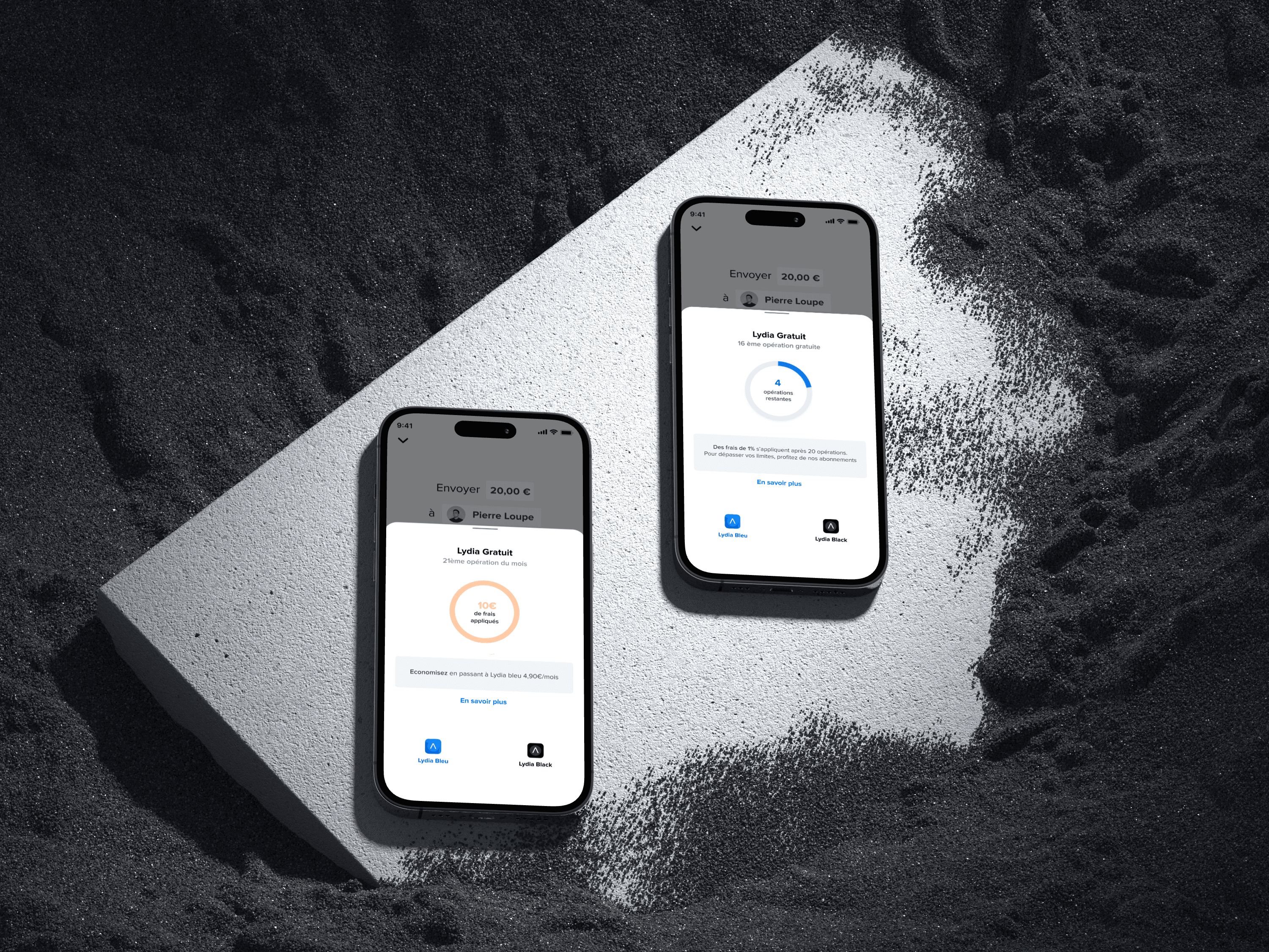
Pop up during payment flow
Users are so familiar with the peer to peer payment flow that they tend to complete their transaction without seeking further information.
We therefore decided to built on this popular feature by implementing an informative pop up about freemium limits during the transaction confirmation flow.
Scenario A : Limits warning
Scenario A : Limits reached
Pop up during
payment flow
Users are so familiar with the peer to peer payment flow that they tend to complete their transaction without seeking further information.
Users are so familiar with the peer to peer payment flow that they tend to complete their transaction without seeking further information.
We therefore decided to built on this popular feature by implementing an informative pop up about freemium limits during the transaction confirmation flow.
Scenario A : Limits warning
Scenario A : Limits reached
Prototyping
FEEDBACK ANALYSIS
Most misunderstood freemium limits and misinterpreted gauges
3/5
participants
Finding #3
Lack of clarity in limits pages. Users questioned the usage limits' meaning
Users intrigued by offers but overwhelmed by detailed descriptions.
Premium plans benefits not sufficiently highlighted
2/5
participants
Finding #4
No one checked their profile, but when guided, they show interest
Profile page irrelevant as an entry point; guided users found the recap summary useful
5/5
participants
Finding #1
Users missed swipe-to-close but valued usage limits info
Pop up perceived as confusing. Users wondered if payment was confirmed
4/5
participants
Finding #2
USABILITY
TESTING
Objectives
1
Check the relevance of new entry points
2
Find ouf if premium limits are understood
3
Analyse user’s viewpoint on pop up
USABILITY
TESTING
Test Process
We conducted five 30 min usability tests with 3 regulars users and 2 occasional users. Participants aged 22 to 35 years old, had been asked to perform this test considering 2 different scenarios.
Task 1 : Getting close to the limits
After having lunch, they had to refund their friend 20€ via Lydia
Task 2 : Freemium limits are exceeded
As they are planning a trip to Canada with friends , they had to send 700€ via Lydia to refund their friends for flight tickets
USABILITY
TESTING
USABILITY TESTING
USABILITY TESTING
Objectives
1
Check the relevance of new entry points
2
Find ouf if premium limits are understood
3
Analyse user’s viewpoint on pop up
USABILITY
TESTING
Test Process
We conducted five 30 min usability tests with 3 regulars users and 2 occasional users. Participants aged 22 to 35 years old, had been asked to perform this test considering 2 different scenarios.
Task 1 : Getting close to the limits
After having lunch, they had to refund their friend 20€ via Lydia
Task 2 : Freemium limits are exceeded
As they are planning a trip to Canada with friends , they had to send 700€ via Lydia to refund their friends for flight tickets
FEEDBACK ANALYSIS
No one checked their profile, but when guided, they show interest
Profile page irrelevant as an entry point; guided users found the recap summary useful
5/5
participants
Finding #1
Users missed swipe-to-close but valued usage limits info
Pop up perceived as confusing. Users wondered if payment was confirmed
4/5
participants
Finding #2
Most misunderstood freemium limits and misinterpreted gauges
3/5
participants
Finding #3
Lack of clarity in limits pages. Users questioned the usage limits' meaning
Users intrigued by offers but overwhelmed by detailed descriptions.
Premium plans benefits not sufficiently highlighted
2/5
participants
Finding #4
PERSONAS
No one checked their profile, but when guided, they show interest
Profile page irrelevant as an entry point; guided users found the recap summary useful
5/5
participants
Finding #1
Users missed swipe-to-close but valued usage limits info
Pop up perceived as confusing. Users wondered if payment was confirmed
4/5
participants
Finding #2
Most misunderstood freemium limits and misinterpreted gauges
3/5
participants
Finding #3
Lack of clarity in limits pages. Users questioned the usage limits' meaning
Users intrigued by offers but overwhelmed by detailed descriptions.
Premium plans benefits not sufficiently highlighted
2/5
participants
Finding #4
Iterate
FINAL SOLUTION - V2
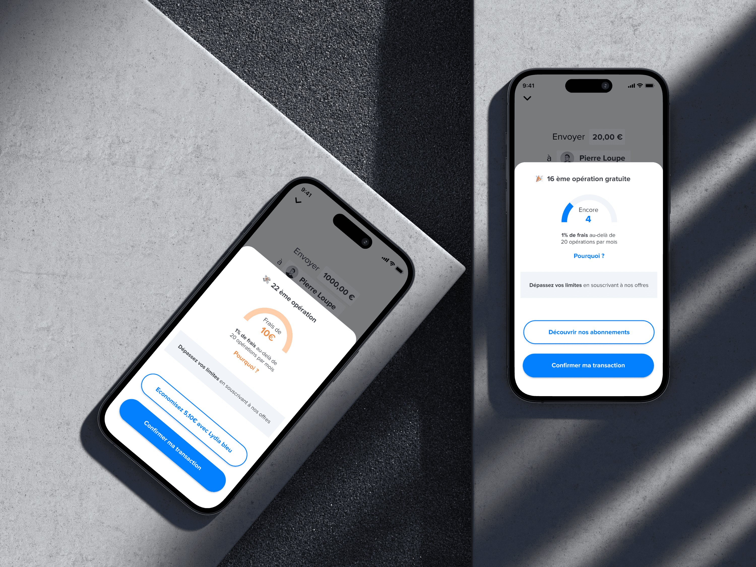
Dual options payment
flow : Confirm or Discover
Primary & Secondary CTA Buttons
Transitioned from a pop-up to a mandatory flow with primary and secondary call-to-action buttons. This ensures that users are guided through the transaction confirmation process without confusion.
Primary & Secondary CTA Buttons
Transitioned from a pop-up to a mandatory flow with primary and secondary call-to-action buttons. This ensures that users are guided through the transaction confirmation process without confusion.
Primary & Secondary CTA Buttons
Transitioned from a pop-up to a mandatory flow with primary and secondary call-to-action buttons. This ensures that users are guided through the transaction confirmation process without confusion.
Primary & Secondary CTA Buttons
Transitioned from a pop-up to a mandatory flow with primary and secondary call-to-action buttons. This ensures that users are guided through the transaction confirmation process without confusion.
UX writing alteration
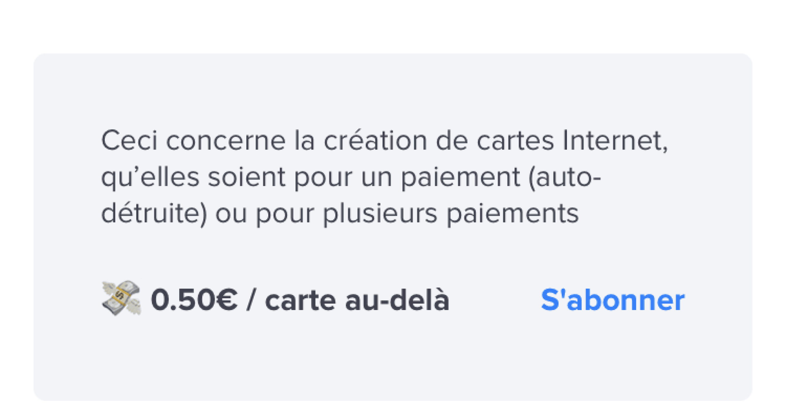
Replaced “Learn more” with a straightforward “Why” to explain applicable fees. This direct approach aims to reduce confusion and potentially optimise user engagement with limit pages.
UX writing alteration
Replaced “Learn more” with a straightforward “Why” to explain applicable fees. This direct approach aims to reduce confusion and potentially optimise user engagement with limit pages.
UX writing alteration
Replaced “Learn more” with a straightforward “Why” to explain applicable fees. This direct approach aims to reduce confusion and potentially optimise user engagement with limit pages.
UX writing
alteration
Replaced “Learn more” with a straightforward “Why” to explain applicable fees. This direct approach aims to reduce confusion and potentially optimise user engagement with limit pages.
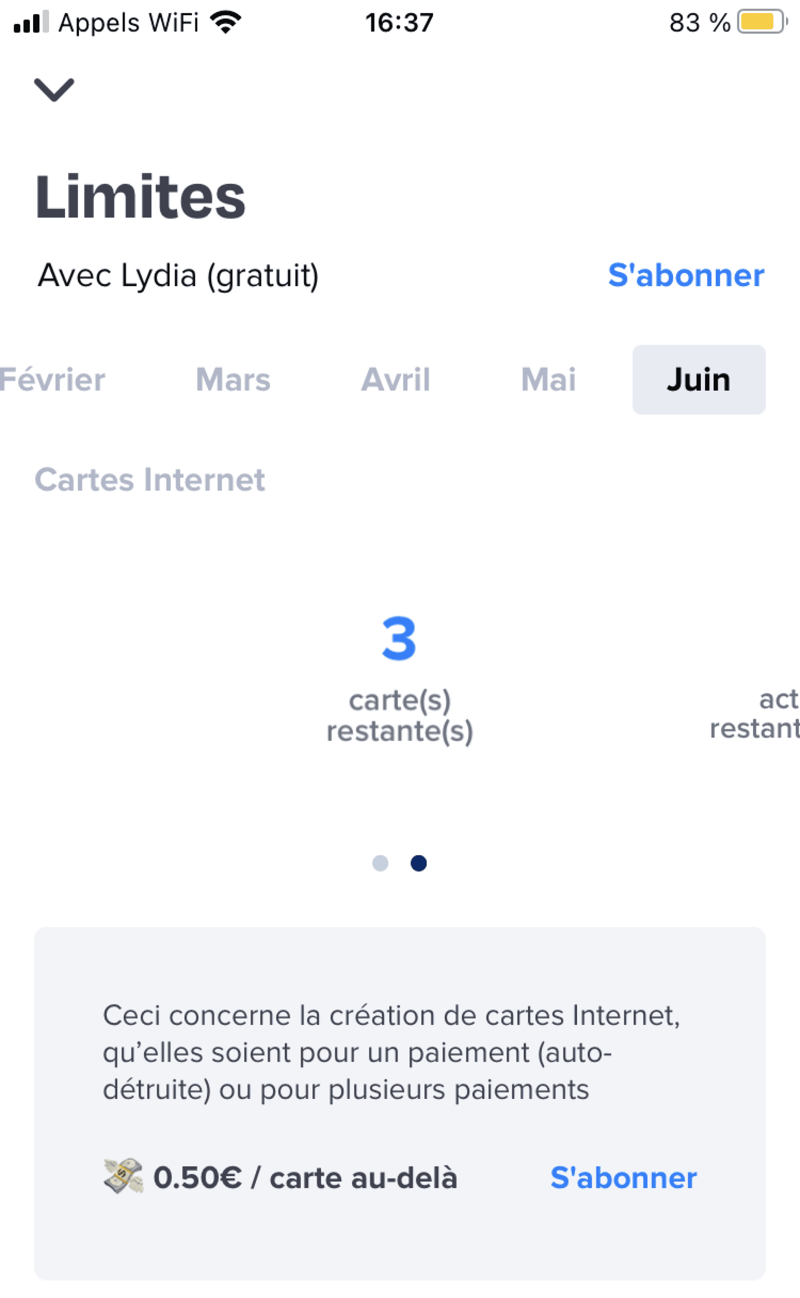
Limits pages renamed
to "My Usage"
Circular Gauges
My usage
To reduce confusion, we renamed limit pages to "My Usage." This change helps users understand that limits refer to their usage and may encourage them to monitor their transactions.
Dot navigation
Lydia Logo “Free”
A "Free Plan" Lydia logo was added to the top right corner of the usage page, emphasizing the user's current free plan and raising awareness of the available paid plans.
Dot navigation
UI optimisation
UI design was enhanced by improving contrast, adding extra details to the circular gauges, and optimizing UX writing

Homepage Summary
To grab users’ attention, we decided the homepage should display content that helps users monitor their monthly usage.
We created a prominent, clickable section summarizing the user's monthly transactions. Users will be redirected to the limit pages when they scroll through this section

Highlighting Key Benefits
To reduce user fatigue and encourage conversion, we highlighted the major benefits of premium plans.
Each premium plan introduction showcases four key features, replacing endless bulleted lists with a user-friendly dropdown menu.
Limits pages renamed to "My Usage"
Circular Gauges
My usage
Dot navigation
Lydia Logo “Free”
Dot navigation
UI optimisation
To reduce confusion, we renamed limit pages to "My Usage." This change helps users understand that limits refer to their usage and may encourage them to monitor their transactions.
A "Free Plan" Lydia logo was added to the top right corner of the usage page, emphasizing the user's current free plan and raising awareness of the available paid plans.
UI design was enhanced by improving contrast, adding extra details to the circular gauges, and optimizing UX writing
Homepage
Summary
To grab users’ attention, we decided the homepage should display content that helps users monitor their monthly usage.
We created a prominent, clickable section summarizing the user's monthly transactions. Users will be redirected to the limit pages when they scroll through this section
Highlighting
Key Benefits
To reduce user fatigue and encourage conversion, we highlighted the major benefits of premium plans.
Each premium plan introduction showcases four key features, replacing endless bulleted lists with a user-friendly dropdown menu.
Limits pages renamed to "My Usage"
Circular Gauges
My usage
To reduce confusion, we renamed limit pages to "My Usage." This change helps users understand that limits refer to their usage and may encourage them to monitor their transactions.
Dot navigation
Lydia Logo “Free”
A "Free Plan" Lydia logo was added to the top right corner of the usage page, emphasizing the user's current free plan and raising awareness of the available paid plans.
Dot navigation
UI optimisation
UI design was enhanced by improving contrast, adding extra details to the circular gauges, and optimizing UX writing
Homepage Summary
To grab users’ attention, we decided the homepage should display content that helps users monitor their monthly usage.
We created a prominent, clickable section summarizing the user's monthly transactions. Users will be redirected to the limit pages when they scroll through this section
Highlighting Key Benefits
To reduce user fatigue and encourage conversion, we highlighted the major benefits of premium plans.
Each premium plan introduction showcases four key features, replacing endless bulleted lists with a user-friendly dropdown menu.
Final Prototype
Final Prototype
Scenario A :
Getting close to the limits
Scenario A :
Getting close to the limits
THANKS FOR VISITING
I would love to help bring your ideas to life
Feel free to reach out !
THANKS FOR VISITING
I would love to help bring your ideas to life
Feel free to reach out !
Reflection
WHAT DID WE ACHIEVE
Enhanced payment flow with dual CTA
Enhanced payment flow with dual CTA
Enhanced payment flow with dual CTA
Enhanced payment flow with dual CTA
Multiplied entry points to the limit pages
Multiplied entry points to the limit pages
Multiplied entry points to the limit pages
Multiplied entry points to the limit pages
Educated Users About Freemium Limits
Educated Users About Freemium Limits
Educated Users About Freemium Limits
Educated Users About Freemium Limits
Raised Awareness About Premium Benefits
Raised Awareness About Premium Benefits
Raised Awareness About Premium Benefits
Raised Awareness About Premium Benefits
IMPLEMENTED ELEMENTS OF REASSURANCE
IMPLEMENTED ELEMENTS OF REASSURANCE
IMPLEMENTED ELEMENTS OF REASSURANCE
IMPLEMENTED ELEMENTS OF REASSURANCE
Structured and Clarified Information
Structured and Clarified Information
Structured and Clarified Information
Structured and Clarified Information
KEY METRICS TO MONITOR

User engagement
Are the new entry points effectively guiding users to payment limit information and encouraging interaction with the limit pages?

Conversion Rate
What is the conversion rate of users upgrading to premium plans? The target conversion rate should ideally be between 5% to 10%.

Support ticket rate
Are we seeing a significant drop in support tickets related to freemium limits ?
Monthly Recurring Revenue
How is the Monthly Recurring Revenue evolving over the months ?
Lydia
A leading mobile financial service with a strong community of free users, seeking to boost premium subscriptions and profitability

MY ROLE
UX/UI Designer
TOOLS
Figma, Notion
TEAM
3 Designers
DATE
2022
SCOPE
2 weeks
Overview
CONTEXT
Case Study
In collaboration with Felix Lepoutre, Lydia's lead designer, our team explored real challenges faced by the product teams. (The Design Crew school)
Company Background
The french company recently expanded beyond peer to peer payment by developing new features and initiated their transition as a super app for financial services. Users can now get accounts, payment cards, loan, insurance, money pots, gift cards...
They want to challenge the traditional retail banking model and drive cashless revolution in Europe with an instant, secure and frictionless mobile first customer focused solution.
They raised over 160 millions in funding from major existing shareholders such as Tencent and Accel to accompany their expansion across Europe.
How can Lydia introduce new usage limits and boost suscription to premium plans ?
CHALLENGE
WHY ?
Next step is profitability
Each transaction incurs a fee, with millions of transactions per month.
An increase of their Monthly Recurring Revenue would contribute to the company’s bottom line.
Lydia launched two premium plans (Lydia Blue & Lydia Black) that offer higher soft & hard limits over the free plan but didn’t raised awareness about free limits.
New limits were introduced to users in January 2021 in regards to monthly transaction volume and payment ceiling but lack in app tracking.
SOLUTIONS
Educate users about usage limits & raise
awareness of premium plans
Payment flow
We created an informative
notification during the payment flow
Entry points
We multiplied strategically placed entry points to the limits pages
Limits & Premium
We structured & clarified info
about limits & premium plans options
Banking expertise
We implemented elements of reassurance regarding their banking expertise
THANKS FOR VISITING
I would love to help bring your ideas to life
Feel free to reach out !
THANKS FOR VISITING
I would love to help bring your ideas to life, feel free to reach out !
THANKS FOR VISITING
I would love to help bring your ideas to life, feel free to reach out !
THANKS FOR VISITING
I would love to help bring your ideas to life
Feel free to reach out !
THANKS FOR VISITING
I would love to help bring your ideas to life
Feel free to reach out !