

MY ROLE
UX/UI Designer
TEAM
3 Designers
DATE
2022
SCOPE
2 weeks


La Fourche
La Fourche
La Fourche
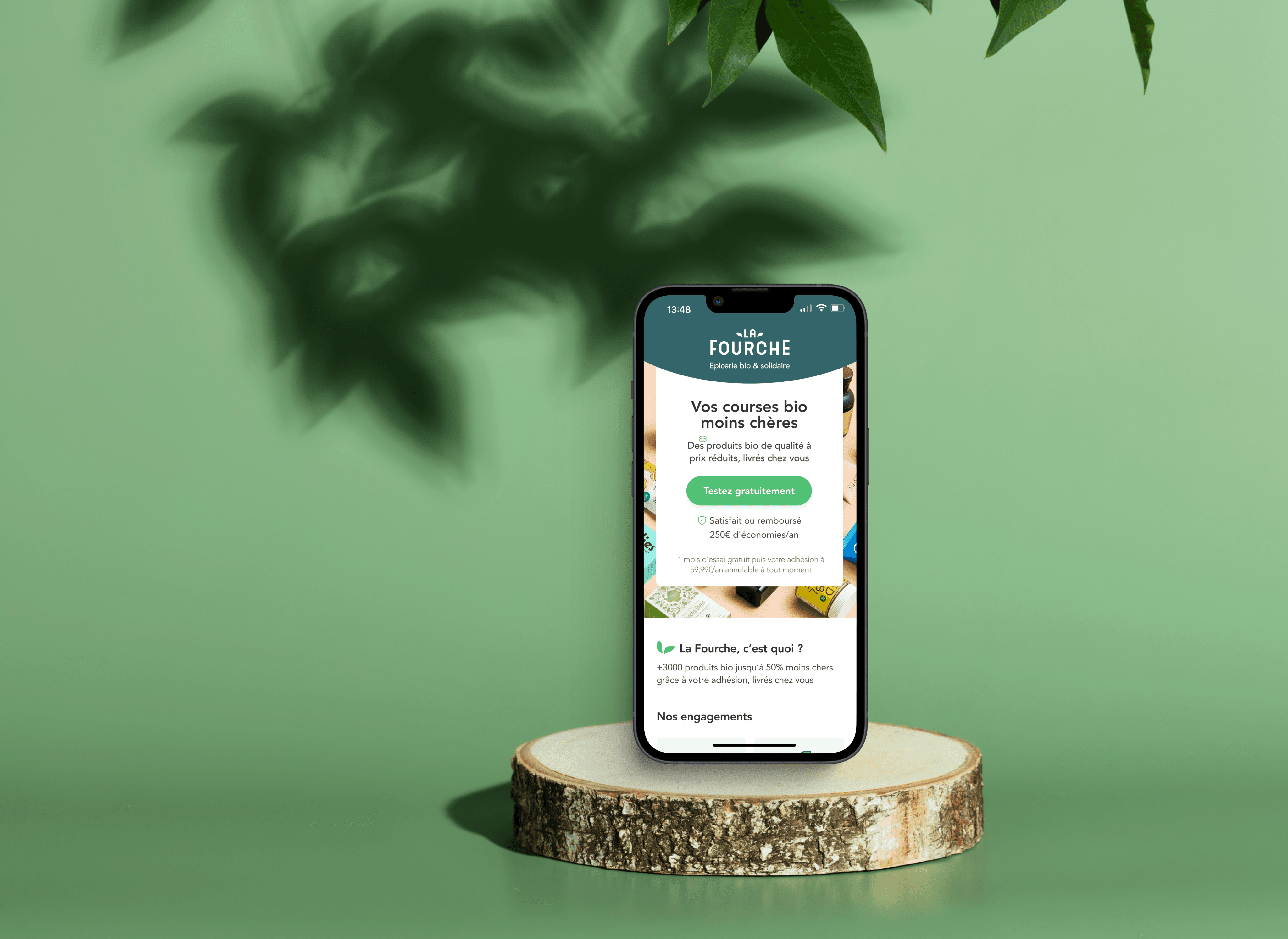
A membership-based organic grocery, focusing on optimizing its mobile-first checkout experience to reduce cart abandonment and boost customer retention.
A membership-based organic grocery online store, focusing on optimizing its mobile-first checkout experience to reduce cart abandonment & boost customer retention.
MY ROLE
UX/UI Designer
TOOLS
Figma, Notion
TEAM
3 Designers
DATE
2022
SCOPE
2 weeks
Overview
CONTEXT
Case Study
In collaboration with Alexia Gilbert, Head of product, our team explored real challenges faced by the product teams. (The Design Crew school)
Company Background
La Fourche is a membership-based online grocery store, launched in 2018, offering organic products up to 50% cheaper than competitors.
The €59.90 annual membership allows the company to offer unbeatable prices compared to traditional retailers. New customers can also benefit from a one-month free trial to explore their range of organic products at preferential rates.
CHALLENGE
How can we oPTIMISE THE CHECKOUT PROCESS IN ORDER TO facilitate first-time ordering & MAKE REORDERING EASIER ?
How can we oPTIMISE THE CHECKOUT PROCESS IN ORDER TO facilitate first-time ordering & MAKE REORDERING EASIER ?
How can we oPTIMISE THE CHECKOUT PROCESS IN ORDER TO facilitate first-time ordering & MAKE REORDERING EASIER ?
How can we oPTIMISE THE CHECKOUT PROCESS IN ORDER TO facilitate first-time ordering & MAKE REORDERING EASIER ?
WHY ?
Reducing Cart Abandonment
In the last three years, La Fourche gathered more than 25 000 members.
After successfully developing their business, they are now focusing on optimising users' experience. Like many e-commerce, La fourche is challenged by a significant cart abandonment rate and churn out rate.
Our mission was to optimise the checkout process to improve those metrics with a responsive website focused on mobile first.
KEY SUCCESS CRITERIAS
Reduce checkout & cart abandonment rate
Abandonment rate
Abandonment rate
Increase mobile conversion
Increase mobile conversion as a primary focus
Mobile Conversion
Mobile Conversion
Decrease the churn rate
after the trial
Churn rate
Churn rate
Net Promoter Score
Net Promoter Score
Increase Net Promoter
Score
Reduce checkout & cart abandonment rate
Abandonment rate
Increase mobile
conversion
Mobile conversion
Decrease the churn rate
after the trial
Churn rate
Increase Net Promoter
Score
Net Promoter Score
SOLUTIONS
Enhancing the user journey with a seamless checkout
1
Clear
membership
Clarify mandatory subscription benefits & discounted prices
2
Alternative
product
Suggest an alternative product when sold out
3
Explore
freely
Remove 0€ subscription barrier, Enable cart exploration freely.
5
Checkout
flow
Facilitate effortless checkout with enhanced navigation feature
6
Optimise UI
Concistency
Ensure a consistent UI reflecting branding throughout the flow
4
Payment &
Shipping
Offer additional payment
methods & shipping
options
SOLUTIONS
Enhancing the user
journey with a seamless checkout
1
1
Clear membership
Clear membership
Clarify mandatory subscription & discounted prices benefits
2
2
Alternative product
Alternative product
Suggest an alternative product when the chosen one is sold out
Suggest an alternative product when the chosen one is sold out
3
3
Explore freely
Explore freely
Remove 0€ subscription barrier, Enable cart exploration freely.
Remove 0€ subscription barrier, Enable cart exploration freely.
4
4
Payment & Shipping
Payment & Shipping
Offer additional payment methods & shipping options
Offer additional payment methods & shipping options
5
5
Checkout flow
Checkout flow
Facilitate effortless checkout with enhanced navigation feature
Facilitate effortless checkout with enhanced navigation feature
6
6
UI Consistency
UI Consistency
Ensure a consistent UI reflecting branding throughout the flow
Ensure a consistent UI reflecting branding throughout the flow
Discover
AUDIT
Identify key pain points in checkout experience
We performed an audit on their responsive website to fully understand consumers' potential frustration. We completed each step of the check out process, from the free trial subscription to placing an order. This qualitative investigation helped us to discern major pain points
Original profile screen
Unclear Membership Concept
Lack of Trust-Building Information
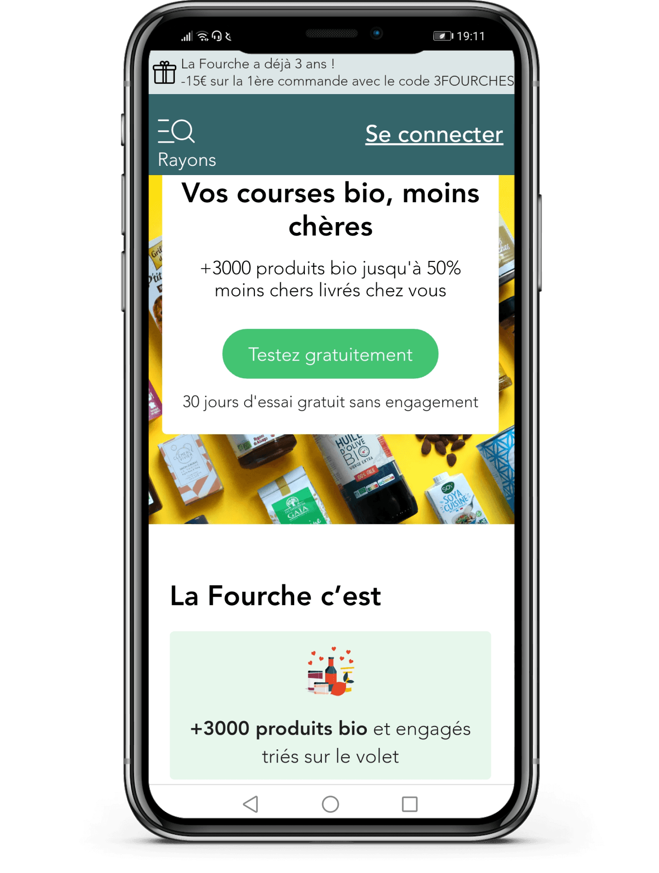
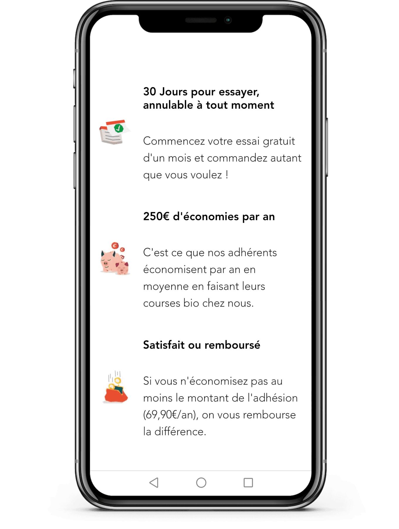
Upon landing on the homepage, there is insufficient information provided to build trust in La Fourche's business model.
Membership Benefits Unexplained
Upon landing on the homepage, there is insufficient information provided to build trust in La Fourche's business model.
Mandatory Subscription Unexplicit
Upon landing on the homepage, there is insufficient information provided to build trust in La Fourche's business model.
Original profile screen




Unclear Membership Concept
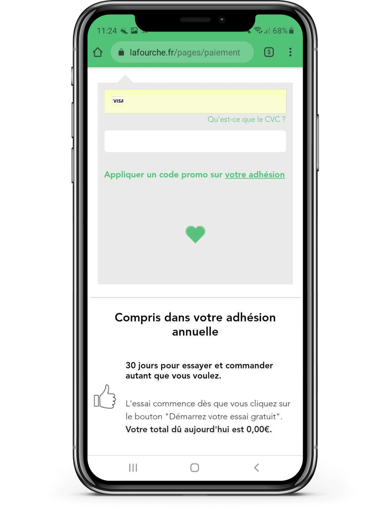
Friction in Free Trial Sign-Up Process
Lack of Trust-Building Information
Early Card Request
Upon landing on the homepage, there is insufficient information provided to build trust in La Fourche's business model.
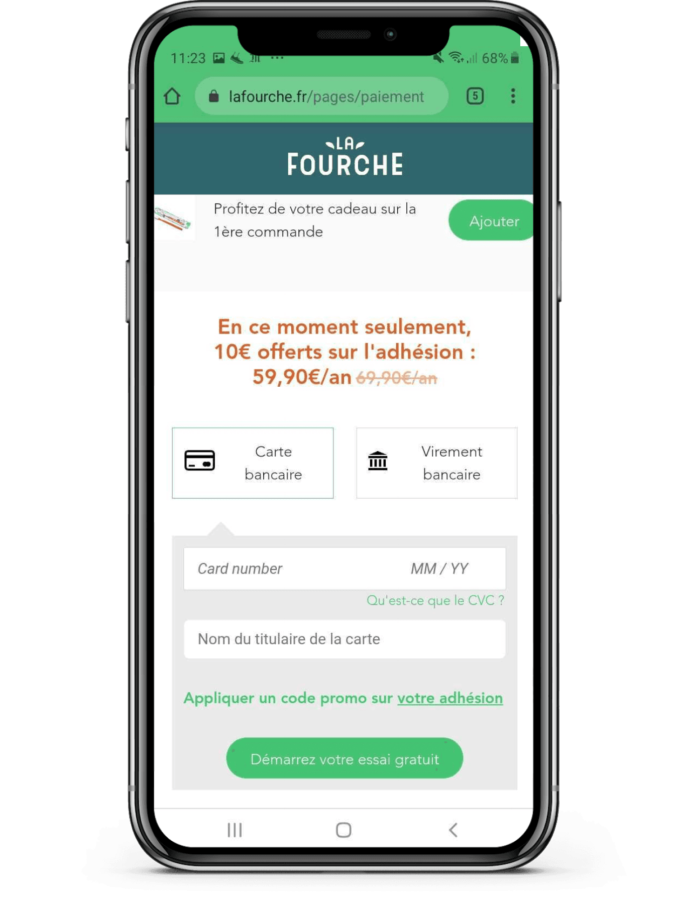
Users must subscribe by providing credit card details and authorizing a €0 charge before adding items to their cart. This can feel pushy and may discourage potential customers.
Membership Benefits Unexplained
Intimidating Process
Consumers are not adequately informed about the benefits of membership or how La Fourche manages to offer such competitive prices. This lack of information can cause indecision during the buying process.
Requiring personal info early is intimidating. Users may prefer providing it at the end of checkout, after completing other steps
Mandatory Subscription Unexplicit
The requirement to subscribe is not immediately clear, leading to confusion. Users do not quickly understand that they must become a member to place an order.
Friction in Free Trial Sign-Up Process
Early Card Request
Users must subscribe by providing credit card details and authorizing a €0 charge before adding items to their cart. This can feel pushy and may discourage potential customers.
Intimidating Process
Requiring personal info early can be intimidating. Users may prefer providing it at the end of checkout, after completing other steps
Original profile screen


Poorly timed
Personalized cart
Poorly timed
Personalized cart
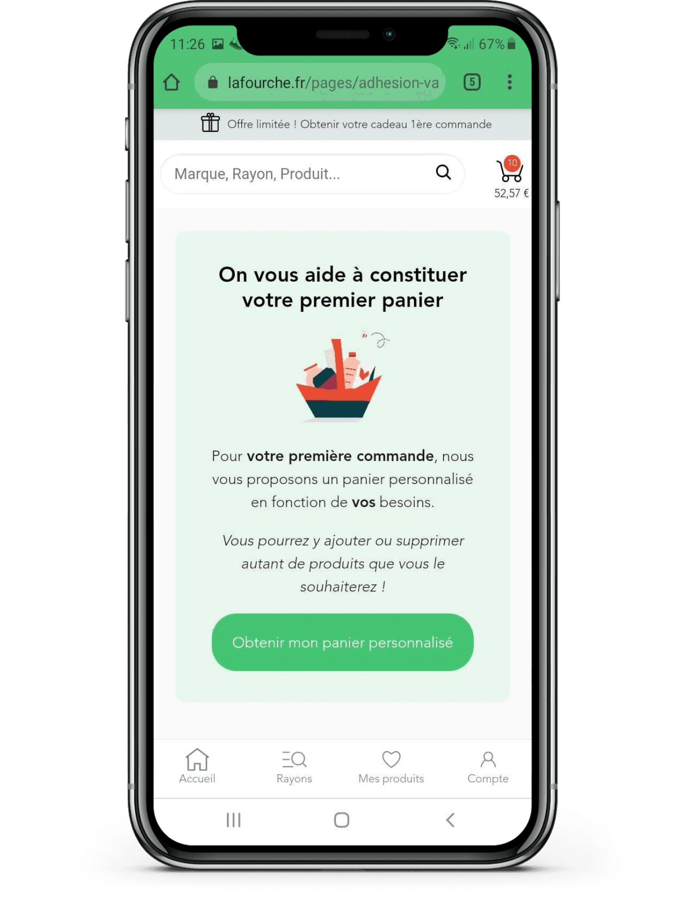

Personalized suggestions are shown too late in the checkout process, disrupting flow and frustrating users, making them ineffective.
Personalized suggestions are shown too late in the process, disrupting flow & frustrating users, making them ineffective.
Personalized suggestions are shown too late in the checkout process, disrupting flow and frustrating users, making them ineffective.
Confusing
Cart Overview
Confusing
Cart Overview
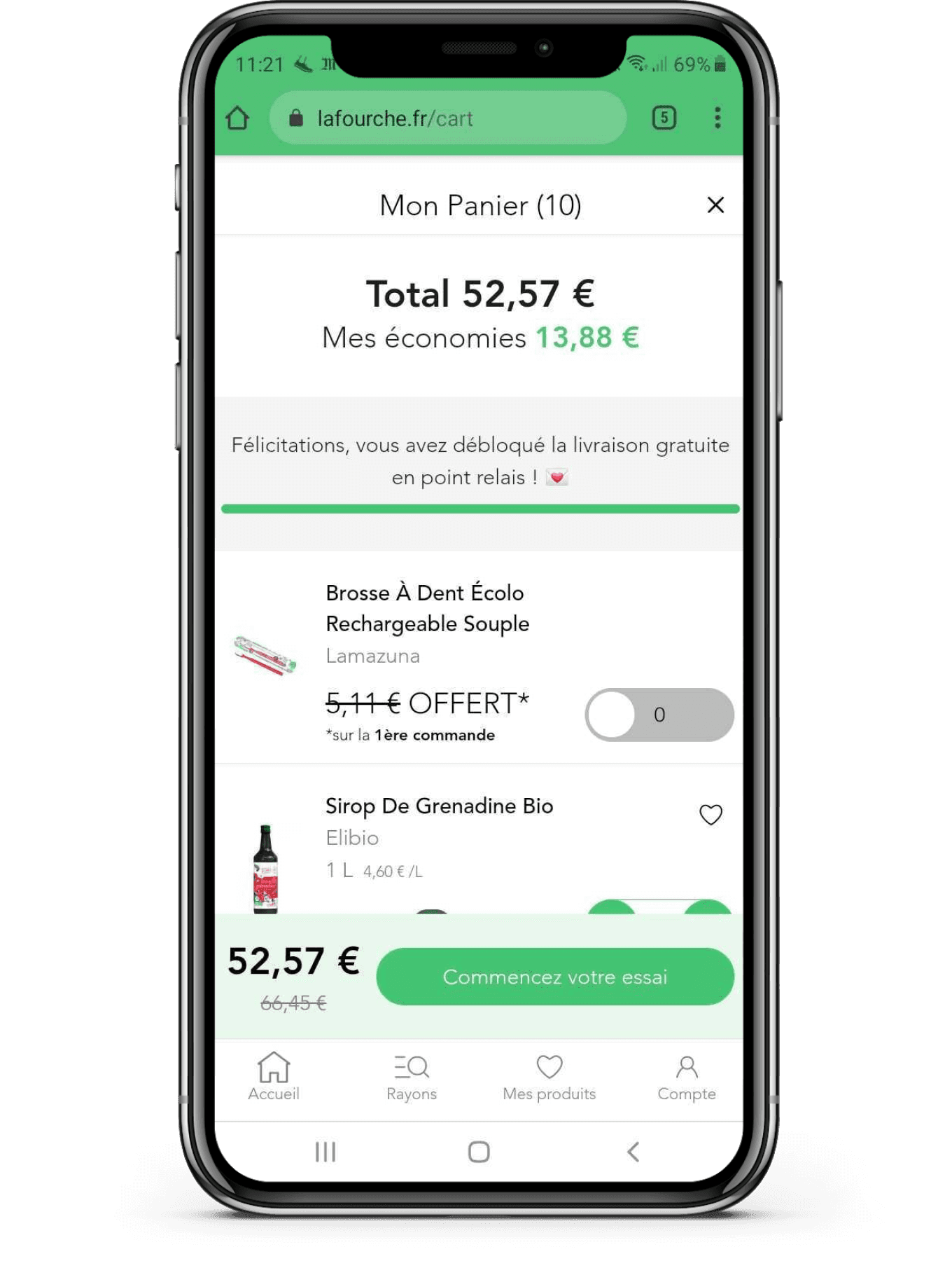

The cart shows unclear details like discounts, a green pickup gauge, and a welcome gift notification, all lacking proper explanation.
The cart shows unclear details: discounts, a green pickup gauge, and a welcome gift notification, all lacking proper explanation.
The cart shows unclear details like discounts, a green pickup gauge, and a welcome gift notification, all lacking proper explanation.
Overemphasis
on Welcome Gift
Overemphasis
on Welcome Gift
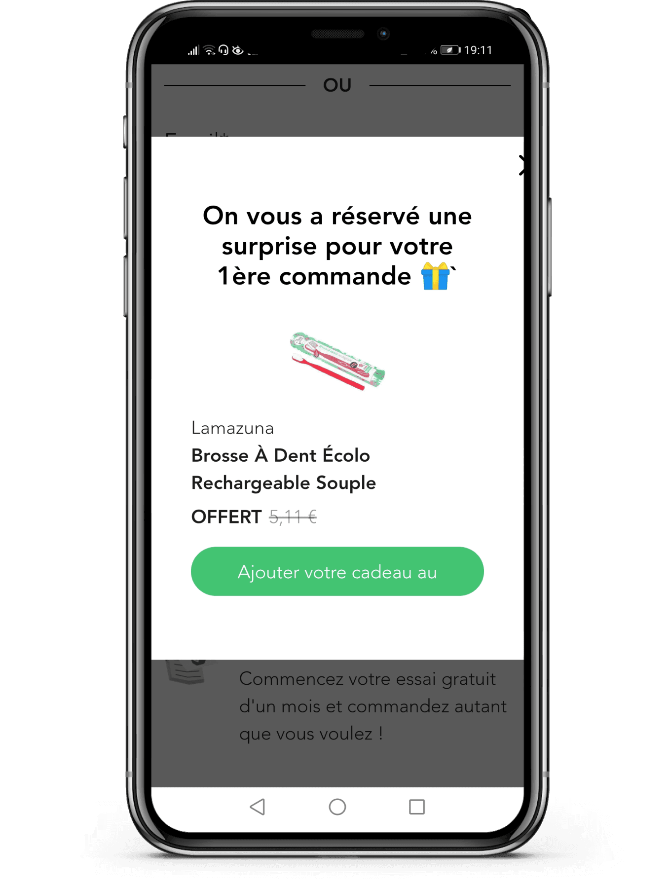

A free gift offer appears too early and too often, frustrating users with its poor timing and repetitive presence during browsing
A free gift offer appears too early and too often, frustrating users with its poor timing and repetitive presence during browsing
BENCHMARKING
identifying competitive features
Through competitive analysis, we identified key features that improved
the checkout process and user experience in various industries :
Through competitive analysis, we identified key features that improved the checkout process and user experience in various industries :
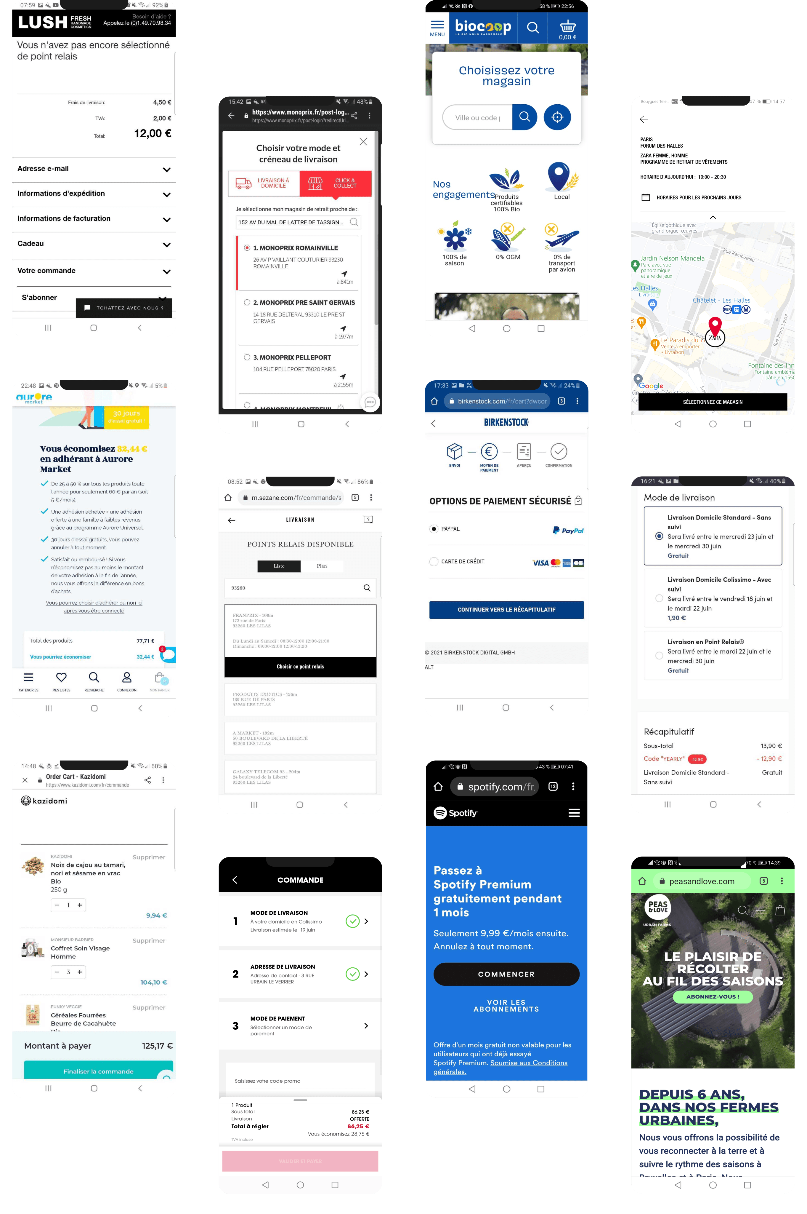


Clear Business Model
Transparent explanations build trust and reduce confusion, helping users feel confident about their order.
Streamlined Free Trial Process
A simple, clear sign-up process encourages users to engage and reduces friction.
Variety of Payment Options
Multiple payment methods cater to user preferences, minimizing cart abandonment.
Simplified Pickup Point Selection
Easy selection of pickup points offers flexibility and improves convenience.
Checkout Progress Bar
A visual indicator helps users navigate the checkout process smoothly and reduces anxiety.
Company Values
Highlighting sustainability and ethics reinforces brand loyalty and connects with users' values.
Checkout Progress Bar
A visual indicator helps users navigate the checkout process smoothly and reduces anxiety.
Simplified Pickup Point Selection
Easy selection of pickup points offers flexibility and improves convenience.
Company Values
Highlighting sustainability and ethics reinforces brand loyalty and connects with users' values.
USERS INTERVIEWS
Conditions & participant profiles
Participants completed an order simulation on La Fourche’s website, using pre-filled
carts to focus on the checkout process. Follow up nterviews refined user expectations and frustrations. The study involved 30-minute sessions with organic consumers aged 24-36 .
Participants completed an order simulation on La Fourche’s website, using pre-filled carts to focus on the checkout process. Follow up interviews refined user expectations and frustrations. The study involved 30-minute sessions with organic consumers aged 24-36 .


Objectives
1
Assess task complexity
Monitor user performance to estimate task
complexity and ensure completion
Monitor user performance to estimate task complexity and ensure completion
2
Evaluate checkout clarity
Gain insights into users' understanding of each checkout step.
Gain insights into users' understanding of each
checkout step.
3
Understand users' behavior
Explore users' habits and expectations when
ordering online.
Explore users' habits and expectations when ordering online.
4
Identify major pain points
Determine major issues causing cart
abandonment.
Determine major issues causing cart abandonment.
Discover
AUDIT
Identify key pain points in checkout experience
We performed an audit on their responsive website to fully understand consumers' potential frustration. We completed each step of the check out process, from the free trial subscription to placing an order. This qualitative investigation helped us to discern major pain points
Friction in Free Trial Sign-Up Process
Early Card Request
Upon landing on the homepage, there is insufficient information provided to build trust in La Fourche's business model.
Intimidating Process
Upon landing on the homepage, there is insufficient information provided to build trust in La Fourche's business model.
Original profile screen


Unclear Membership Concept
Lack of Trust-Building
Upon landing on the homepage, there is insufficient information provided to build trust in La Fourche's business model.
Membership Benefits Unexplained
Upon landing on the homepage, there is insufficient information provided to build trust in La Fourche's business model.
Mandatory Subscription Unexplicit
Upon landing on the homepage, there is insufficient information provided to build trust in La Fourche's business model.
Original profile screen


Poorly Timed
Personalized Cart

Personalized suggestions are shown too late in the checkout process, disrupting flow and frustrating users, making them ineffective.
Confusing
Cart Overview

The cart shows unclear details like discounts, a green pickup gauge, and a welcome gift notification, all lacking proper explanation.
Overemphasis
on Welcome Gift

A free gift offer appears too early and too often, frustrating users with its poor timing and repetitive presence during browsing
BENCHMARKING
identifying competitive features
Through competitive analysis, we identified key features that improved the checkout process and user experience in various industries :


Clear Business Model
Transparent explanations build trust and reduce confusion, helping users feel confident about their order.
Streamlined Free Trial Process
A simple, clear sign-up process encourages users to engage and reduces friction.
Variety of Payment Options
Multiple payment methods cater to user preferences, minimizing cart abandonment.
Checkout Progress Bar
A visual indicator helps users navigate the checkout process smoothly and reduces anxiety.
Simplified Pickup Point Selection
Easy selection of pickup points offers flexibility and improves convenience.
Company Values
Highlighting sustainability and ethics reinforces brand loyalty and connects with users' values.
Conditions & participants profiles
Participants completed an order simulation on La Fourche’s website, using pre-filled carts to focus on the checkout process. Follow up interviews refined user expectations and frustrations. The study involved 30-minute sessions with organic consumers aged 24-36 .
USER INTERVIEWS


Objectives
1
Assess task complexity
Monitor user performance to estimate task complexity and ensure completion
2
Evaluate checkout clarity
Gain insights into users' understanding of each checkout step.
3
Understand users' behavior
Explore users' habits and expectations when ordering online.
4
Identify major pain points
Determine major issues causing cart abandonment.
Learning #1
Several reasons for not confirming their shopping cart immediately
4/5
participants
Sold out products
Price comparison
Ensure completeness
Learning #2
Strikethrough prices & percentage discounts are deemed unreliable
4/5
participants
Uncertainty if discounts are special offers or inflated prices.
Margaux, 26 yo
Organic consumer

I usually create shopping carts, save them and add items as I go.
”
“
Learning #3
Shipping options & delivery date are critical in their purchase decision-making process
4/5
participants
Package mass &
collection site positionForecasted
Learning #4
Limited payment
options
highlighted
3/5
participants
Users frequently
pointed out the
absence of PayPal
Learning #1
Several reasons for not confirming their shopping cart immediately
4/5
participants
Sold out products
Price comparison
Ensure completeness
Learning #2
Strikethrough prices & percentage discounts are misinterpreted and deemed unreliable
Strikethrough prices & percentage discounts are deemed unreliable
4/5
participants
Uncertainty if discounts are special offers or inflated prices.
Blondine, 36 yo
Organic consumer

I usually create shopping carts, save them and add items as I go.
”
“
Learning #3
Shipping options & delivery date are critical in their purchase decision-making process
4/5
participants
Package mass &
collection site positionForecasted
Learning #4
Limited payment
options
highlighted
3/5
participants
Users frequently
pointed out the
absence of PayPal
Define
HOW MIGHT WE
1
Clarify La Fourche's values & membership concept to reassure potential members & build trust ?
2
Reduce frustration by optimising the checkout experience and make tasks more seamless ?
3
Minimise distractions and deliver a visually pleasing design to empover effortless purchasing ?
Define
HOW MIGHT WE
1
1
1
Clarify La Fourche's values & membership concept to reassure potential members & build trust ?
Clarify La Fourche's values & membership concept to reassure potential members & build trust ?
Clarify La Fourche's values & membership concept to reassure potential members & build trust ?
2
2
2
Reduce frustration by optimising the checkout experience and make tasks more seamless ?
Reduce frustration by optimising the checkout experience and make tasks more seamless ?
Reduce frustration by optimising the checkout experience and make tasks more seamless ?
3
3
3
Minimise distractions and deliver a visually pleasing design to empover effortless purchasing ?
Minimise distractions & deliver a visually pleasing design to empover effortless purchasing ?
Minimise distractions and deliver a visually pleasing design to empover effortless purchasing ?
Develop
MINDMAP
Optimal checkout process
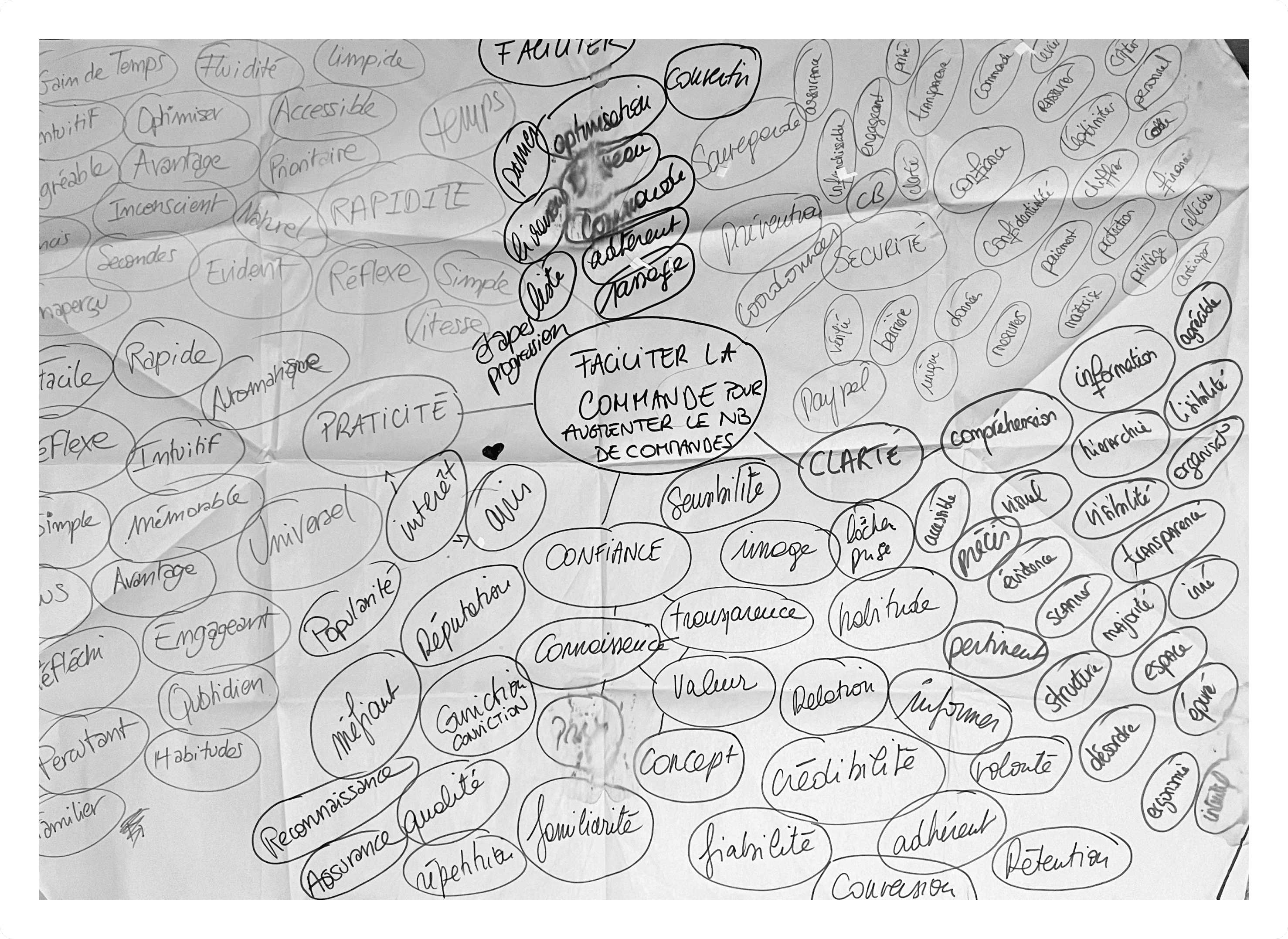
After gathering user feedback, benchmarking best practices in e-commerce checkout processes and addressing key "How Might We" questions, we held an ideation session to boost creativity.
We started with a mind map to organize ideas on essential features for an optimal checkout process:
After gathering user feedback, benchmarking best practices in e-commerce checkout processes and addressing key "How Might We" questions, we held an ideation session to boost creativity.
We started with a mind map to organize ideas on essential features for an optimal checkout process:


Trust & Credibility
Trust & Credibility
Emphasize the company’s core values and mission to build customer trust and confidence
Speed & Convenience
Speed & Convenience
Reduce the number of steps and clicks for a faster checkout process
Mobile Optimization
Mobile Optimization
Ensure the checkout process is fully optimized for mobile devices, enhancing usability.
Intuitive Navigation
Enable smooth transitions between the shopping cart and store to ensure easy navigation
Error handling
Provide clear 1 helpful error messages to guide users in correcting mistakes .
Clarity & Simplicity
Provide clear visual progress indicator to guide users through the checkout
Trust & Credibility
Emphasize the company’s core values and mission to build customer trust and confidence
Speed & Convenience
Reduce the number of steps and clicks for a faster checkout process
Mobile Optimization
Ensure the checkout process is fully optimized for mobile devices, enhancing usability.
Intuitive Navigation
Enable smooth transitions between the shopping cart and store to ensure easy navigation
Error handling
Provide clear 1 helpful error messages to guide users in correcting mistakes .
Clarity & Simplicity
Provide clear visual progress indicator to guide users through the checkout
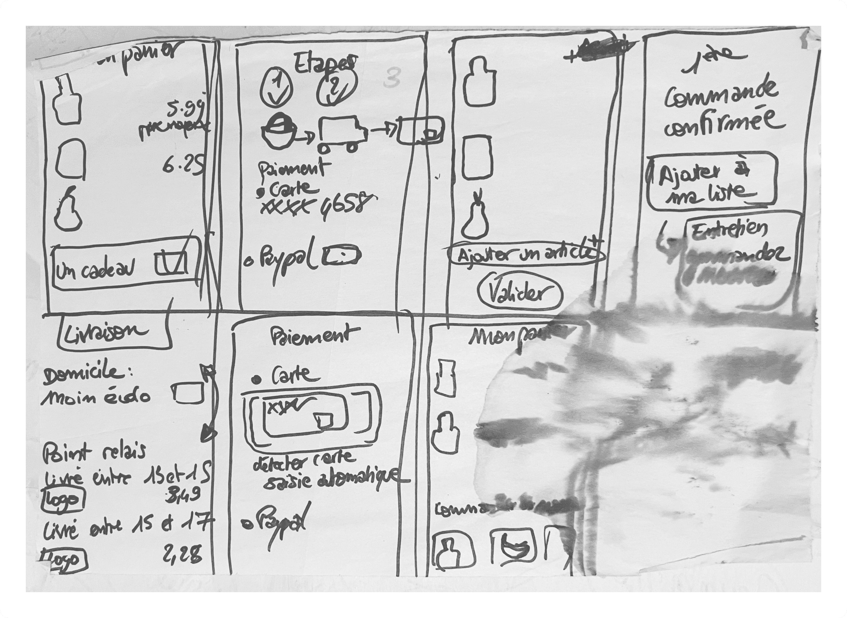
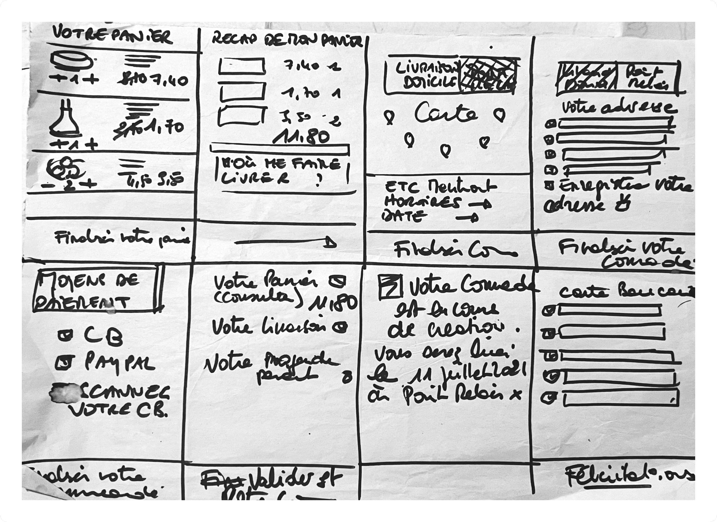
CRAZY 8S
Clear Checkout progress
This ideation stage ended with a Crazy 8s. During this fast sketching exercise, we generated many different ideas within a short period of time and then began converging on some ideas to start working on our prototypes.
This ideation stage ended with a Crazy 8s. During this fast sketching exercise, we generated many different ideas within a short period of time and then began converging on some ideas to start working on our prototypes.




Deliver
SOLUTION
SOLUTION
Prototype V1
To offer a smooth and efficient checkout experience, the speed of use was a top priority when prototyping our solutions. The check out should be as straightforward and quick as possible. We also prioritised mobile user experience by including prominent CTA buttons.
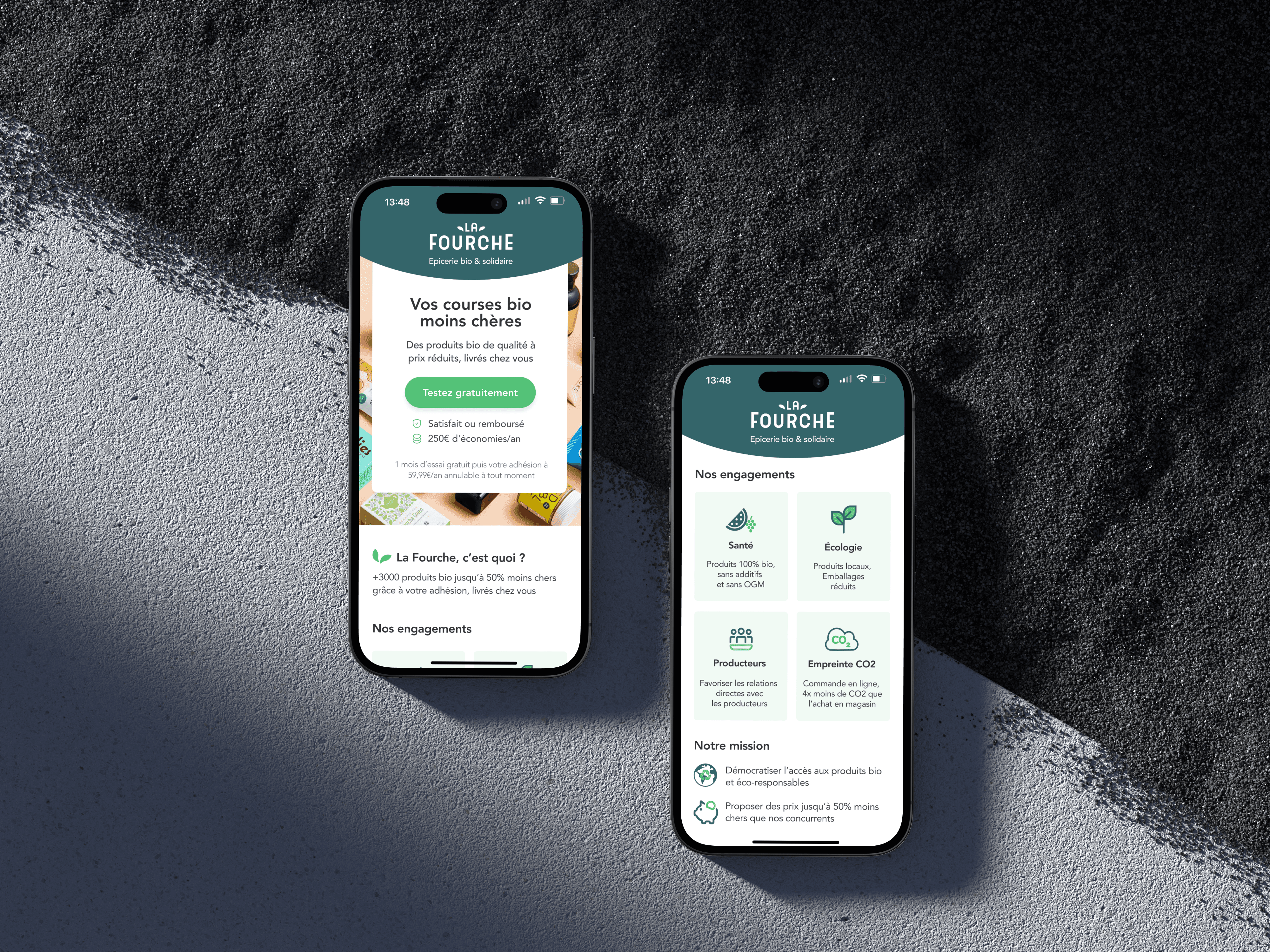


Building consumer trust
Subscription Transparency
Homepage clearly communicates that membership is required to place an order with the annual subscription price next to the free trial CTA. This approach ensures users understand the commitment involved and supports informed decision-making from the start.
Core Values Display
Icons visually represent La Fourche's eco-friendly practices reinforcing the brand’s values in a clear and accessible way.
SOLUTION
Prototype V1
To offer a smooth and efficient checkout experience, the speed of use was a top priority when prototyping our solutions. The check out should be as straightforward and quick as possible. We also prioritised mobile user experience by including prominent CTA buttons.


Building consumer trust
Subscription Transparency
Homepage clearly communicates that membership is required to place an order with the annual subscription price next to the free trial CTA. This approach ensures users understand the involved and supports informed decision-making from the start.
Core Values Display
Icons visually represent La Fourche's eco-friendly practices reinforcing the brand’s values in a clear and accessible way.
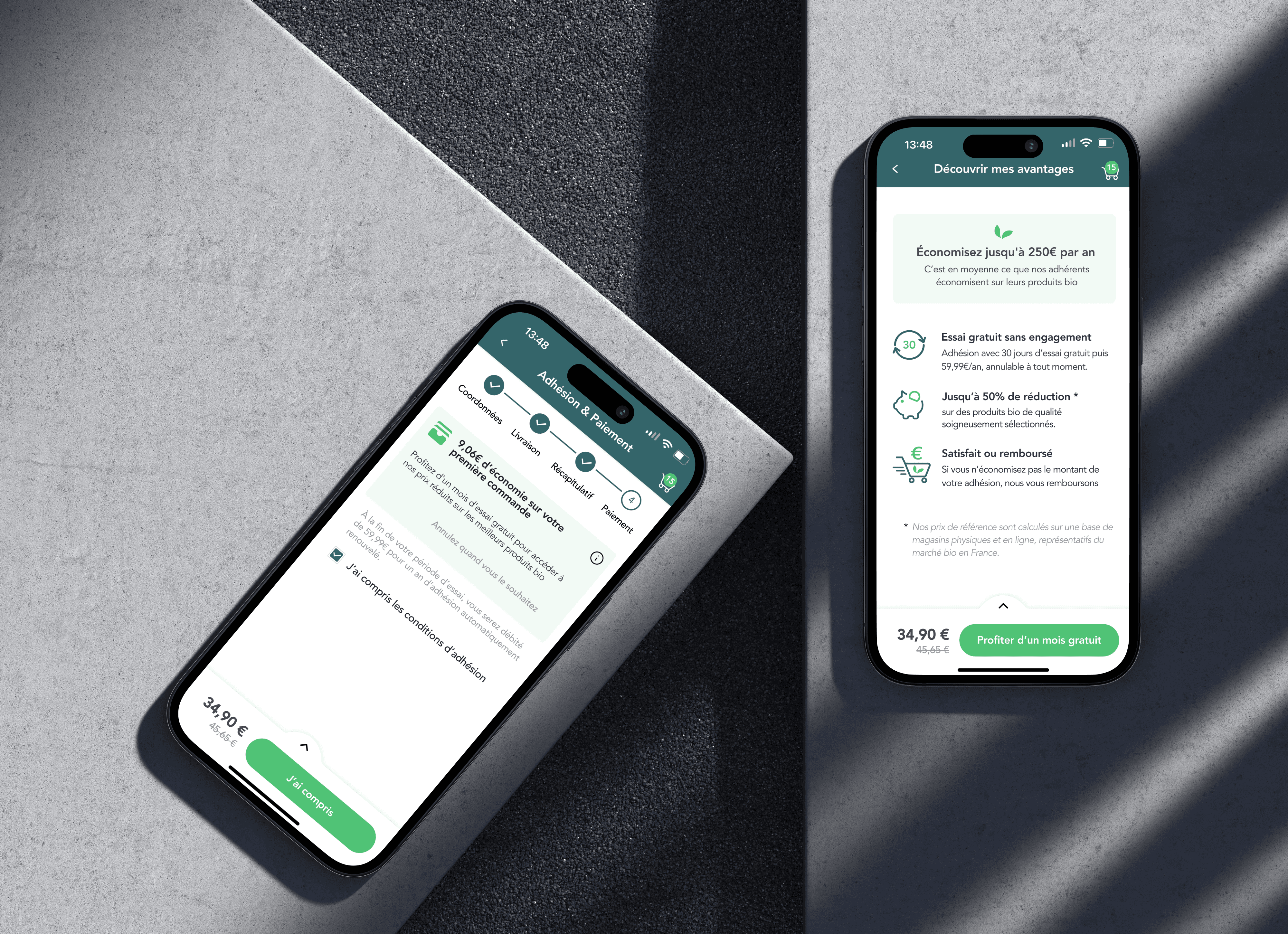

Trial & membership terms
Trial Conditions and Membership Benefits
These screens clearly communicate the free trial conditions, mandatory membership details, and key benefits, helping users understand what they gain through membership.
Reference Price Calculation
With a detailed explanation of reference price calculations, the design promotes informed decision-making and enhances user confidence with an optimal transparency.
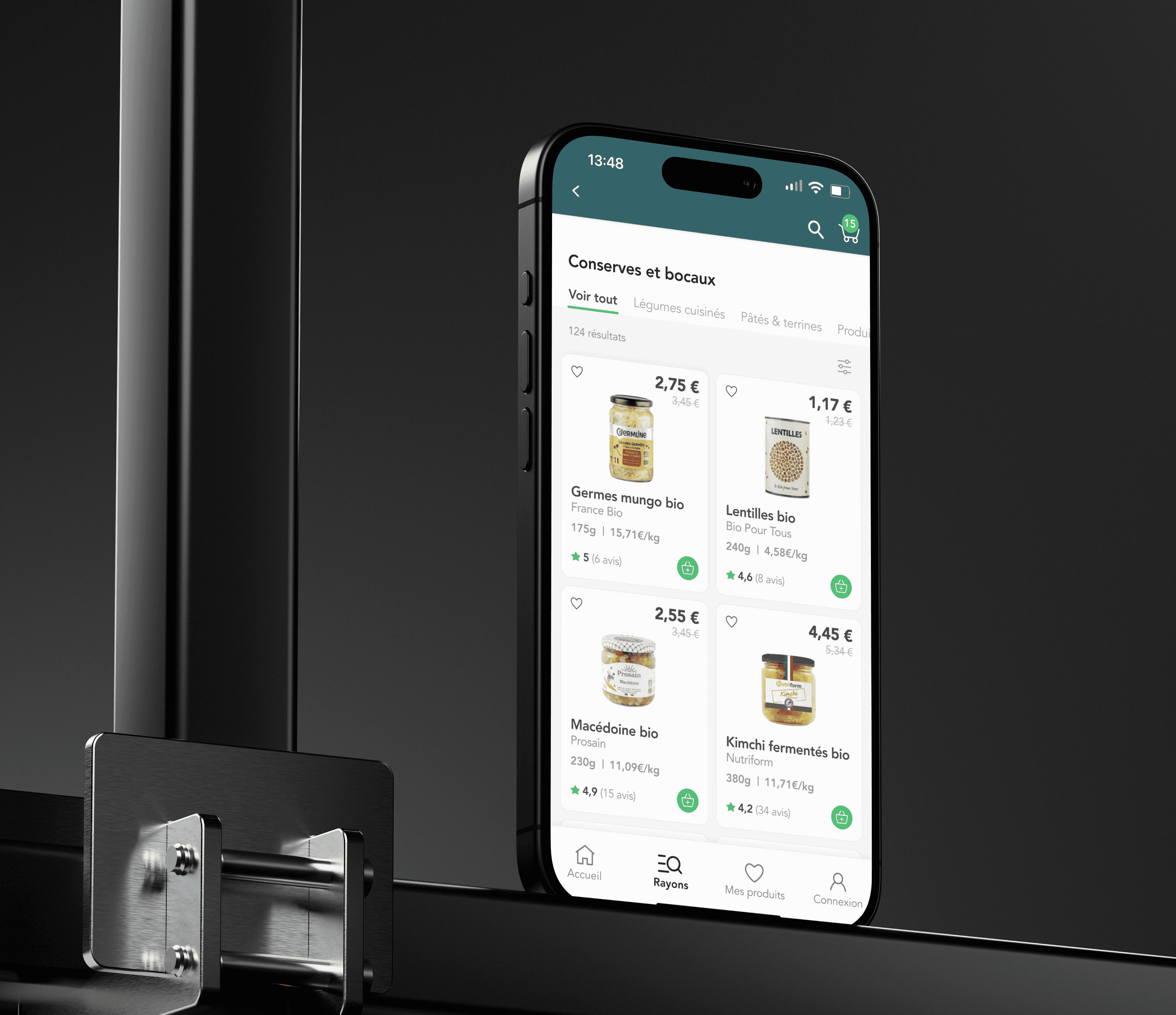

Minimising Confusion
Remove Percentage Discounts
Removing discount labels prevents confusion with other promotions, allowing users to understand the value of offers without mixed signals.
Cut Down on Distractions
We reduced free gift notifications to streamline browsing, letting users focus on products without unnecessary interruptions.
Optimising UI Design
Streamlined Checkout Flow Aligned With Branding
We redesigned the checkout process to ensure it aligns seamlessly with the brand’s visual identity, creating a cohesive and intuitive experience.
Simplified Steps for a Smoother User Experience
Each step is clarified, providing users with a clean and consistent interface that smoothly guides them through the checkout.
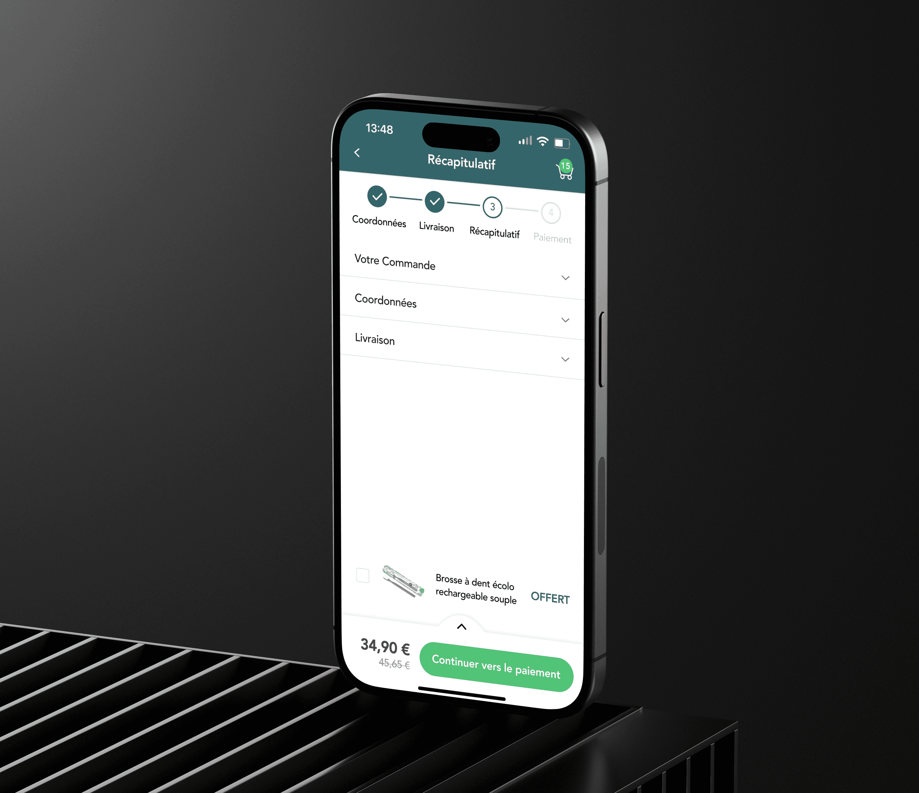

Effortless Checkout: Navigating with Ease
Quick access to your cart via the new cart icon 🛒
A progress bar ⦿—○—○ shows how far you are in the checkout process, allowing you to review your order before final confirmation.
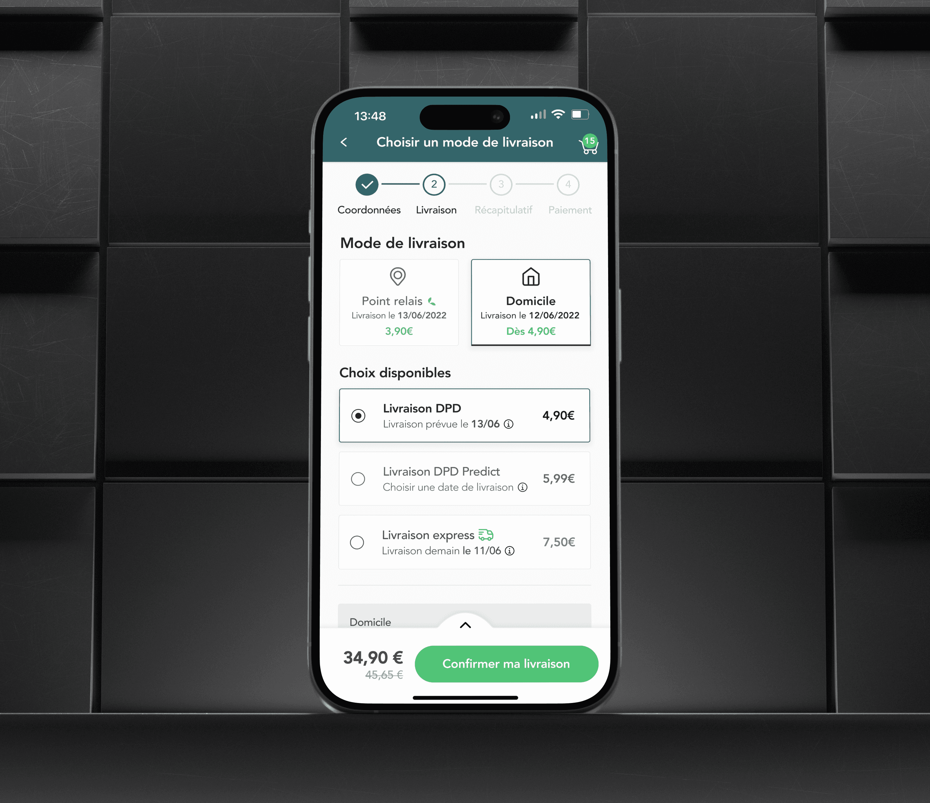

Refined Delivery Options
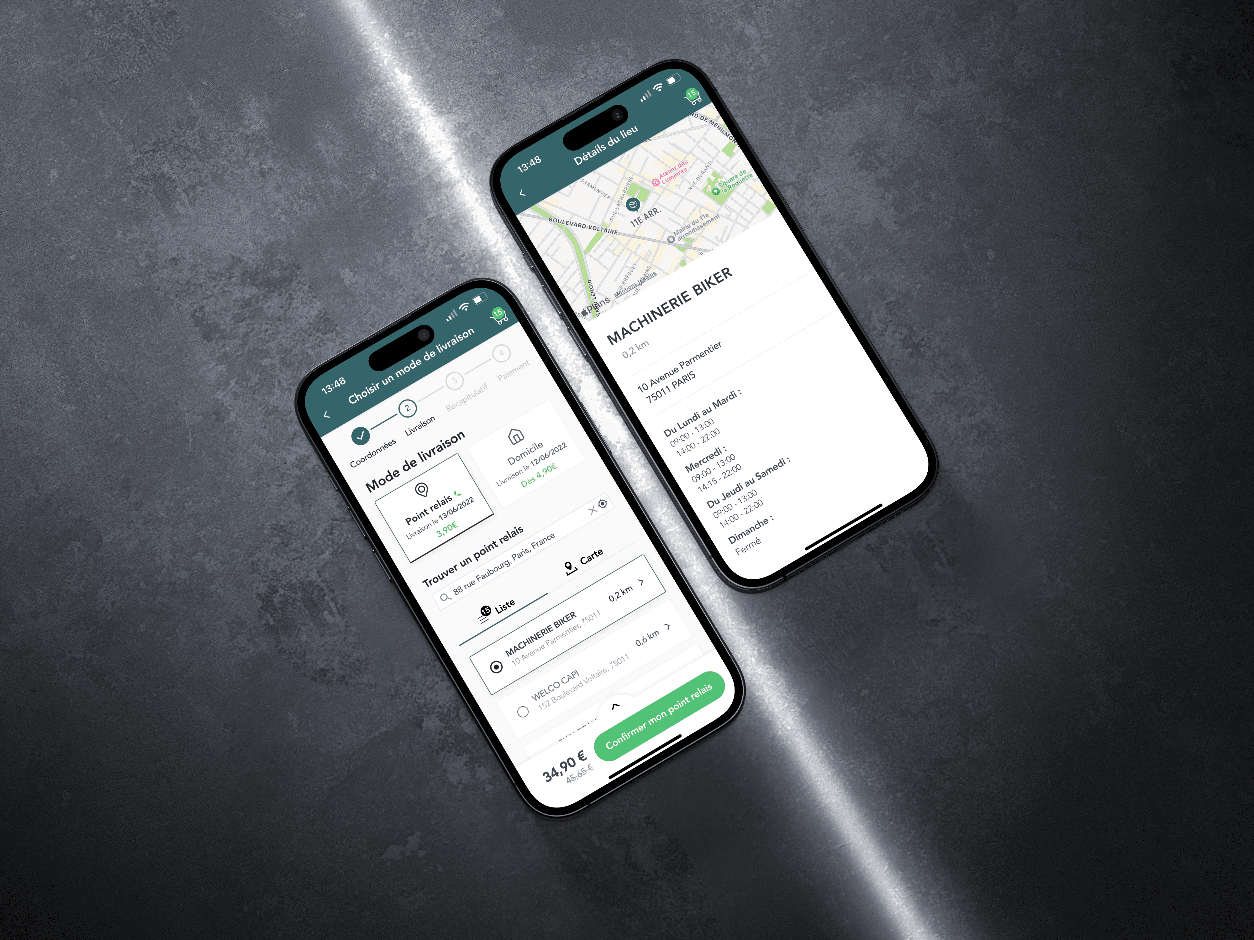
Informed Delivery Selection
We redesigned the delivery process to enhance clarity, making parcel weights accessible via a dropdown and highlighting pick-up point distances to prevent inconvenient, distant locations.
Predictive Home Delivery Dates
We added the Predict option to provide specific home delivery dates, addressing frequent frustrations about unclear delivery timings.


Reducing cart abandonment
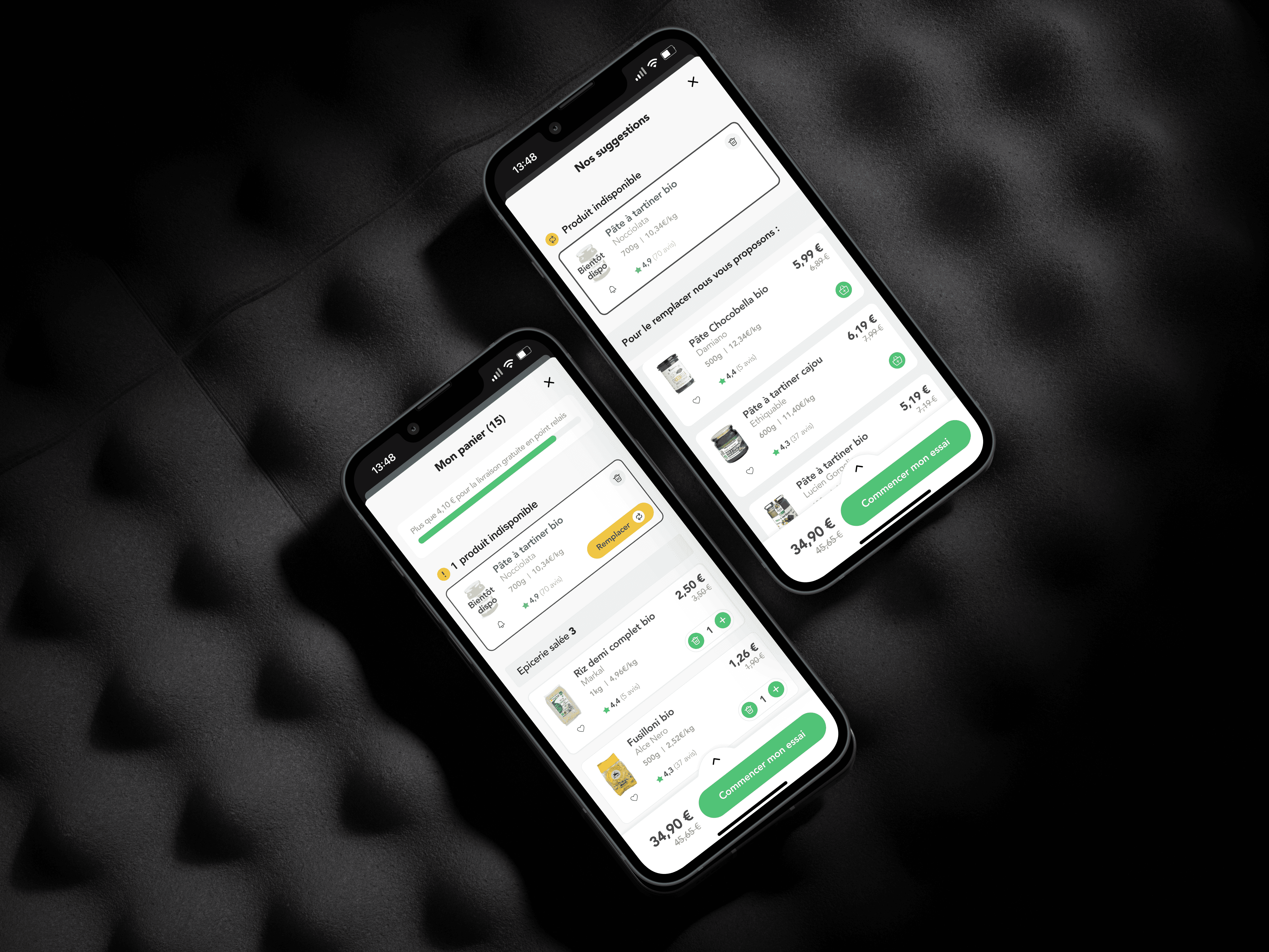
Substitute Product Suggestions
To tackle the frequent issue of cart abandonment due to out-of-stock items, we introduced a "shuffle" button next to unavailable products. This feature suggests similar items, allowing users to easily find alternatives and complete their purchase.
Product Ratings Integration
By integrating product ratings directly in the cart, we provide quick access to user feedback, allowing shoppers to make informed choices and feel more confident about completing their purchase.


Trial & membership terms
Trial Conditions and Membership Benefits
These screens clearly communicate the free trial conditions, mandatory membership details, and key benefits, helping users understand what they gain through membership.
Reference Price Calculation
With a detailed explanation of reference price calculations, the design promotes informed decision-making and enhances user confidence with an optimal transparency.


Minimising
Confusion
Remove Percentage Discounts
Removing discount labels prevents confusion with other promotions, allowing users to understand the value of offers without mixed signals.
Cut Down on Distractions
We reduced free gift notifications to streamline browsing, letting users focus on products without unnecessary interruptions.
Optimising
UI Design
Streamlined Checkout Flow Aligned With Branding
We redesigned the checkout process to ensure it aligns seamlessly with the brand’s visual identity, creating a cohesive and intuitive experience.
Simplified Steps for a Smoother User Experience
Each step is clarified, providing users with a clean and consistent interface that smoothly guides them through the checkout.


Effortless Checkout: Navigating with Ease
Quick access to your cart via the new cart icon 🛒
A progress bar ⦿—○—○ shows how far you are in the checkout process, allowing you to review your order before final confirmation.
Effortless Checkout: Navigating with Ease
Quick access to your cart via the new cart icon 🛒
A progress bar ⦿—○—○ shows how far you are in the checkout process,
allowing you to review your order before final confirmation.


Refined Delivery Options
Refined Delivery Options
Informed Delivery Selection
We redesigned the delivery process to enhance clarity, making parcel weights accessible via a dropdown and highlighting pick-up point distances to prevent inconvenient, distant locations.
Predictive Home Delivery Dates
We added the Predict option to provide specific home delivery dates, addressing frequent frustrations about unclear delivery timings.


USABILITY TESTING
Test conditions
We conducted usability tests with 6 participants aged 26 to 36 yo who had been asked to complete each step of the checkout.The goal was to test our solution concept and detect pain points in our prototype.


Reducing cart abandonment
Substitute Product Suggestions
To tackle the frequent issue of cart abandonment due to out-of-stock items, we introduced a "shuffle" button next to unavailable products. This feature suggests similar items, allowing users to easily find alternatives and complete their purchase.
Product Ratings Integration
By integrating product ratings directly in the cart, we provide quick access to user feedback, allowing shoppers to make informed choices and feel more confident about completing their purchase.
Finding #1
Special offers have a strong impact on conversion
rates.
6/6
participants
reacted enthusiastically
to discount coupons and special deals
Finding #2
Unclear membership requirements cause hesitation during purchase
3/6
participants
were unaware that membership was mandatory for placing an order.
We're forced to join early without
being able to browse freely. Registration should only be required at cart confirmation, it's too pushy
”
“
Cynthia, 26 yo
Active member

Finding #3
Strikethrough pricing still causes confusion about actual savings
3/6
participants
Unsure about the crossed-out prices and La Fourche's reference pricing.
Finding #4
Delivery process creates friction, especially pick-up location selection
2/6
participants
had trouble selecting a
pick-up location during
the delivery stage.
Finding #5
The membership onboarding process is seen as repetitive & disruptive
2/6
participants
found the membership onboarding intrusive and disruptive
USABILITY TESTING
Test conditions
We conducted usability tests with 6 participants aged 26 to 36 yo who had been asked to complete each step of the checkout.The goal was to test our solution concept and detect pain points in our prototype.
Finding #1
Special offers have a strong impact on conversion
rates.
6/6
participants
reacted enthusiastically
to discount coupons and special deals
reacted enthusiastically
to discount coupons
and special deals
Finding #2
Unclear membership requirements cause hesitation during purchase
3/6
participants
were unaware that membership was mandatory for placing an order.
We're forced to join early without being able to browse freely. Registration should only be required at cart confirmation, it's too pushy
”
“
Cynthia, 26 yo
Active member

Finding #3
Strikethrough pricing still causes confusion about actual savings
3/6
participants
Unsure about the crossed-out prices and La Fourche's reference pricing.
Finding #4
Delivery process creates friction, especially pick-up location selection
2/6
participants
had trouble selecting a
pick-up location during
the delivery stage.
Finding #3
Strikethrough pricing still causes confusion about actual savings
3/6
participants
Unsure about the crossed-out prices and La Fourche's reference pricing.
Unsure about the crossed-
out prices and La Fourche's reference pricing.
Finding #5
The membership onboarding process is seen as repetitive & disruptive
2/6
participants
found the membership onboarding intrusive and disruptive
Finding #4
Delivery process creates friction, especially pick-up location selection
2/6
participants
had trouble selecting a
pick-up location during
the delivery stage.
had trouble selecting a
pick-up location during
the delivery stage.
Finding #5
The membership onboarding process is seen as repetitive & disruptive
2/6
participants
found the membership onboarding intrusive and disruptive
ITERATION
Optimising our solution
Reinforce signals trust
Clarify reference pricing, highlight money-back guarantee, refine brand intrduction
Reinforce signals trust
Clarify reference pricing, highlight money-back guarantee, refine brand intrduction
Optimise confirmation
Optimise confirmation
Display order details and allow modifications within an hour post-purchase.
Display order details and allow modifications within an hour post-purchase.
Streamline delivery
Streamline delivery
Enhance user interface and streamline delivery process for time efficiency.
Enhance user interface and streamline delivery process for time efficiency.
Facilitate login & checkout
Implement social login to speed up the checkout flow promoting a frictionless user journey.
Implement social login to speed up the checkout flow promoting a frictionless user journey.
Reflection
WHAT DID WE ACHIEVE
CLARIFY LA FOURCHE MEMBERSHIP CONCEPT
CLARIFY LA FOURCHE MEMBERSHIP CONCEPT
REMOVE THE 0 € DEBIT AT AN EARLY STAGE
REMOVE THE 0 € DEBIT AT AN EARLY STAGE
ENSURE CONSISTENT UI DESIGN
ENSURE CONSISTENT UI DESIGN
EXPAND PAYMENT & SHIPPING OPTIONS
EXPAND PAYMENT & SHIPPING OPTIONS
SUGGEST AN ALTERNATIVE PRODUCT
SUGGEST AN ALTERNATIVE PRODUCT
CLARIFY LA FOURCHE MEMBERSHIP CONCEPT
CLARIFY LA FOURCHE MEMBERSHIP CONCEPT
REMOVE THE O € DIRECT DEBIT AT AN EARLY STAGE
REMOVE THE O € DIRECT DEBIT AT AN EARLY STAGE
ENSURE CONSISTENT UI DESIGN ACROSS THE FLOW
ENSURE CONSISTENT UI DESIGN ACROSS THE FLOW
EXPAND PAYMENT METHODS & SHIPPING OPTIONS
EXPAND PAYMENT METHODS & SHIPPING OPTIONS
SUGGEST AN ALTERNATIVE PRODUCT WHEN SOLD OUT
SUGGEST AN ALTERNATIVE PRODUCT WHEN SOLD OUT
KEY METRICS TO MONITOR
Checkout abandoment rate
Checkout
abandoment rate
Checkout abandoment rate
Check if the optimization of the checkout process is sufficient to reduce the initial 38% checkout abandonment rate. How many users leave between the fist and last step of the checkout ?
Mobile conversion rate
Mobile
conversion rate
Mobile conversion rate
Is there an increase in the mobile conversion rate ? Is it getting closer to the desktop conversion rate of 7% ?
Churn Rate After Free Trial
Churn Rate
After Free Trial
Churn Rate After Free Trial
Is the user experience pleasant enough to reduce the churn rate of 35% after the 30-day free trial and encourage users to continue their membership?
Repurchase rate
Repurchase
rate
Repurchase rate
Are strategies like facilitating reordering and offering special incentives effectively increasing repeat purchases among members?
THANKS FOR VISITING
I would love to help bring your ideas to life, feel free to reach out !
THANKS FOR VISITING
I would love to help bring your ideas to life, feel free to reach out !
THANKS FOR VISITING
I would love to help bring your ideas to life
Feel free to reach out !